Evaluation and Progression
This photograph worked particularly well because it focuses solely on the textures within the wood. The background is unfocused which makes it easy to ignore the distracctions in the background. I adjusted the brightness on the camera from +1 to +3 because the photo orginally consisted of shadows which masked the intricate details wthin the engrains of wood. This works extremely well with the subject topic of texture because it shows deep ridges in which we can see details - each individual ridge is different. Usually, people would not look at this object and imagine how this could be interesting to look at. However, I think that this picture represents how, with the right angle and camera setting, you can achieve a final outcome which brings more life to an object. If I were to take this photo again, I would take it at a different angle which excluded the objects incorporated in the background - this would mean it would only be the texture and details of the object that would be the main focus instead of the objects in the background also.
In my opinion, editing this photograph was not an option because I felt that the lines and texture of the wood already stood out extremely well. I thought that the photo may look odd if I had cropped out the objects in the backround - I already thought that this worked well and the background objects did not override the textures of the wood in the foreground. I don't think that editing would make this picture any better, however possibly I could take the image from a different angle to show only the textures of the object.
 I think that this photo worked well as representing texture because it was more effective in showing texture in comparison to other photographs that I had taken of bricks. The photograph clearly shows the rough texture of the bricks because the details are deep which therefore are more outlined. In my opinon, when
looking at texture, it is important to remember that people need to be able to imagine how the object would feel or look like if they were to touch it or see it in real life. Taking this into mind, I feel like this image works well with showing the texture that people would imagine bricks to have. Howeverr, I think that this photograph looks almost rounded - it makes it hard to look at the textures in the bricks. I also think that the vivid colour of the wall dampens the boldness of the texturesd on the bricks. I also think that the details in each indiviual brick is hard to focus on and the bricjks as a pattern are what we look at more.
 Therefore, I used Photoshop to chnage the photo into black and white. After this, I then used to 'curves' editing option to darken the image. This is because I think that a dark photograph outlines the textures better than if the photo were to be coloured or bright. I like how by editing this photograph, the details which were orginally hard to see are now more visible. By adapting this, it works better with the subject of texture rather than pattern, as it is eaiser to view each indicidual brick tather than all of the bricks as a whole.
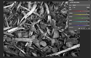
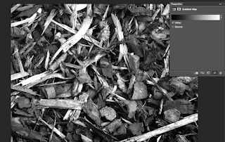
 I chose this photograph as one whihc worked well becasue it is different to the ones which I have shown above. The individual pieces of bark itself do not create the texture (like the indivual ridges and the individual bricks shown above) however all the pieces of bark put together as a whole picture are what creates the texture. Each piece of bark has very little details within it, which is what makes this photograph different to the rest. The layers of bark are instead what creates the texture - you can see where pieces of bark lay on top of each other ad gaps where pieces of bark do not lie. The photograph is conciously taken from an angle which is far away because it would be hard to capture the details in an individual peice of bark and relate this to texture. I felt like this was effective in showing texture because it was obvious and that very little changes needed to be applied.
To edit this photograph, I used Photoshop to changeit into black and white. I then adjusted the gradient map to brighten the whites in the image - I felt as if there was a sign of sullness which was dominant when I orginally chandged it into black and white. I also adjusted the colours within the black and white layer - adjusting each colour in an attempt to make the outlines of each indidvual pieces of bark stand out better. These were the only changes that I made to this photograoh because it wokred well with presenting texture.

I like this photograh because it shows deep texture of a painted surface. The bright red paint allows the ridges to stand out more and the bright light in the corner makes the textures stand out better. To take this photograph, I adjusted the shutter speed so that the photograph was taken quicker and therefore, I was bale to capture the extremely focused texture on the surface. I think painted surfaces are intriguing to photograph when looking at texture because they represet a different way to photograph an object relating to texture. I also adjusted the brightness on the camera to make it more dull - there was a bright light which was already shining onto the photo and therefore I needed to lower the brightness so that it wasn't too overpowering that the intense textures and details were not as visible. This photograph was so effective, that I decide to leave it untouched and not edit it at all.

This photograph consists of several different textures - the pavement tiles look smooth but the photo also consists of some rough patches. I chose this pciture as one which worked well because I liked how it showed different textures.
Each individual tile is different and is similar to the other pictures that I have takem - where the indidvual objects containing the different textures are what we focus on, rather than the picture as a whole. In comparison, if the tiles were all the same, this picture would work better whixch the subject pattern than it would texture. Again, I felt as if this photo required little adjustments.
Progression

I chose this photo as one of the ones which would need improving. I chose this one because I did not take it at the correct angle for this subject topic. It does not really show texture at all because I haven't taken it close enough to show it. In my opinion, this photo works better with the subject topic of pattern.

a very good post, lots of annotation I like that this is making your work much more evaluative.. well done...
ReplyDelete