Planning
 Evaluation and Progression
Evaluation

I chose this image as one which I wanted to explore and progress because I like how this shows London from above and because it is not something I would usually photograph. I took this image on the London Eye which is a popular place in London. It shows the city from high which means that people can see across London. I therefore seized this opportunity to capture a great landscape image whereby the extremely built up city can be seen. I like this image because you can see the Big Ben which is another popular object in London. Due to there being so many popular places in London which large groups of people visit daily, it means that the city is constantly busy. I wanted to photograph this because from what we can see of London from above, there are buildings/houses covering the entire area which again highlights just how busy the city is.
Progression

To edit this image, I used Photoshop to enhance the colours because the original image was too dark and it was hard to see the buildings well. I had noticed that the colours were very plain and muted, even the water was a grey colour. The colours we may see in a rural environment such as greens, oranges, yellows etc such as in forests are not visible here. There are barely any trees or greenery as everything has been built upon. Furthermore, there is not really any interesting colours presented here as they are all dull blues, greys, browns etc. Therefore, I adjusted the vibrancy, exposure, saturation and brightness options on Photoshop. This has made the buildings more outlined and made the picture brighter as a whole. I like the developed image because it is a good landscape of London from above.
Evaluation
I took this image in Canary Wharf, London. This is another popular place in London which again, many people visit daily. I like this image because of the orange tones in the skyline. I also like how the buildings are arranged against the skyline which acts as a good background. I like how the picture is fairly dark but the background illuminates the outlines of the buildings. I also like how we can not see any details of the buildings because it prevents us from distractions and helps us to focus on the buildings as a whole and what they mean. There are lots of cars parked and a group of buildings in the background which suggests that even in different parts of London, it still is busy and built up. I like this landscape because it looks like something which would be used as a picturesque background.
Progression

To develop this image further, I used Photoshop to adjust the colours because although I liked the dark mask in the picture, I wanted the orange tones in the skyline to be vivid also. I liked the edited image better because the buildings are darker but the background is brighter which makes a better base of the buildings' silhouettes. I also cropped out the moving car from the image because I felt like it was unnecessary in being there. It split the image up which is not what I wanted to the image to present because it distracted us away from what I wanted the eye to focus on. If I were to take this image again, I would possibly try to get closer to the buildings, to the point where I could still present them against the skyline but cut out distractions.
Evaluation

This image shows one of London's many busy underground train stations. A large amount of people use train services daily. In the picture, there are crammed escalators and many people are rushing to reach their destination. I wanted to take an image such as this one to present life in a busy city like London, not only because it is not a typical picture of the buildings/tourist attractions, but because it shows how there is a high demand surrounding train/bus services due to London being such a wide spread, highly populated area. Here you can see that there is little space to manoeuvre because of how busy it is. I like this image because I was able to capture how busy the underground stations in London can be on an ordinary day. I was also able to capture a small amount of motion blur because people were rushing and walking fast.
Progression
To progress this image, I used Photoshop to make only subtle adjustments to it such as: turning it into black and white, making the vibrancy higher and making it more contrasted. I think that the black and white version of this image is better at presenting the business of the underground station because it merges the commuters together rather than our eyes focusing of certain individuals. Our eyes are also better lead towards the centre of the picture and therefore, the busy escalators. The black and white I think, also highlights the emotions the people are displaying. For example, we may now notice the fact that there is no one in sight who is actually smiling, possibly because everyone is rushing to where they want to get to.


 Here I took an idea from my mind map of taking photographs of forests as showing rural life. When living in a rural area, there are forests located in close proximity and therefore, it is not uncommon to see here. In an urban area, such as London which I had previously photographed, most of the rural life has been destroyed due to demand of housing and buildings. Furthermore, there would not be particularly many forests such as this one when walking the streets of somewhere such as London. I like this image because the trees create a natural walkway for visitors to walk down and I like the fact that it creates a calming effect due to the muted colours and overcast sky.
  To progress my work, I used Photoshop to make only subtle adjustments because I think that the original picture worked well. I made adjustments to the saturation, contrast, curves and exposure settings here. The colours have been intensified and the picture generally looks brighter and better. If I were to take this picture again, I would maybe use a tripod and try to capture more of the tree length in to add depth to the image.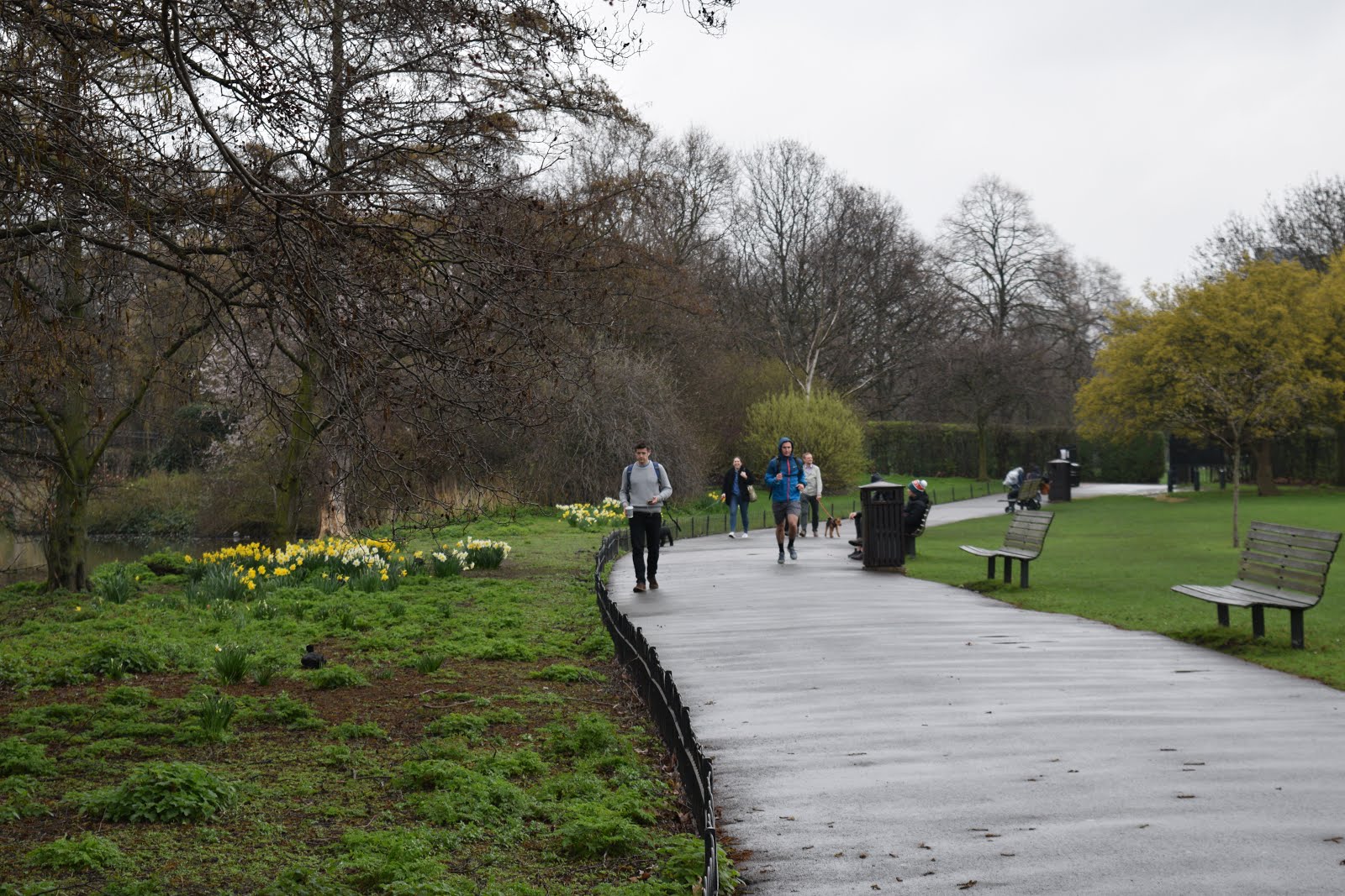

 Here is my final edited image of the one previously shown. I used Photoshop to make some only small, subtle adjustments to this picture because I really liked it how it was. I adjusted the contrast and vibrancy of the colours which made them more vivid. I also adjusted the brightness and exposure of the image to make the people in the distance more visible. I like the final image better than the original one, despite only small adjustments being made. I like how the colours such as the green grass and the dashes of yellows from the planted flowers are now more saturated and vivid. This really highlights the beauty of an urban area such as this one. I don't think that I would do anything particularly different if I were to reshoot this image because I really like the final outcome. I feel like I really took my time when thinking about many things which build a good photograph such as composition, angle lighting and camera settings when taking this image.


 I like this image because it is unusual. It is not common to see a red double decker bus in the countryside amongst fields because we would usually expect to see them in a heavy populated area in England such as London. As we can see, there are not many places for a double decker bus to go because there are not very many houses or buildings around. the vibrant red colour of the bus contrasts against the green of the fields. These are an example of complimentary colours.


 To edit this image, I used Photoshop to enhance the colours because the original image was too dark and it was hard to see the buildings well. I had noticed that the colours were very plain and muted, even the water was a grey colour. The colours we may see in a rural environment such as greens, oranges, yellows etc such as in forests are not visible here. There are barely any trees or greenery as everything has been built upon. Furthermore, there is not really any interesting colours presented here as they are all dull blues, greys, browns etc. Therefore, I adjusted the vibrancy, exposure, saturation and brightness options on Photoshop. This has made the buildings more outlined and made the picture brighter as a whole. I like the developed image because it is a good landscape of London from above.


 This image shows one of London's many busy underground train stations. A large amount of people use train services daily. In the picture, there are crammed escalators and many people are rushing to reach their destination. I wanted to take an image such as this one to present life in a busy city like London, not only because it is not a typical picture of the buildings/tourist attractions, but because it shows how there is a high demand surrounding train/bus services due to London being such a wide spread, highly populated area. Here you can see that there is little space to manoeuvre because of how busy it is. I like this image because I was able to capture how busy the underground stations in London can be on an ordinary day. I was also able to capture a small amount of motion blur because people were rushing and walking fast.


 I chose this image as one which should be adjusted or retaken because I do not think that it accurately presents landscape. I think that it is uninteresting and should be taken at a better angle. I could maybe use a tripod to take an image at a accurate angle and maybe to get more of the building and landscape in. I went back to retake this image (shown below). I think the mage shown below does work better than the one previous however, I would need to make some adjustments using Photoshop using crop, contrast , curves and so on to improve the appearance of the picture. I could also turn it into black and white as I do not like the colours presented in this picture.


