
Evaluation and Progression
Evaluation
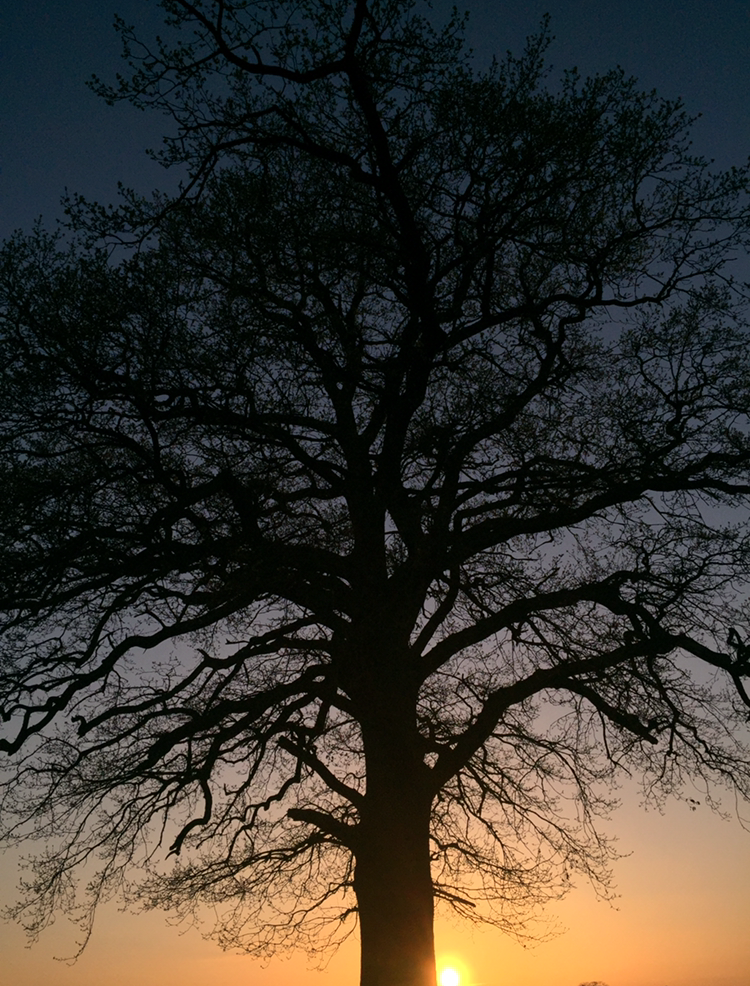 I really like this picture. I chose it as one of my favourites because I find it gripping. The sunset has enhanced the shape of the tree and it's branches, creating a sharp silhouette. The tree has a distinctive and crisp shape. I think it is one of my best takes on shape photography because it holds a unique shape and the image is very picturesque. The shape of the tree is distorted due to the bare branches. Furthermore, the shape of the tree would not look as unique if the leaves were not shed because the tree would have a 'full' shape. The angle that I have taken this at works particularly well because it present the whole tree and it's shape. Personally, I would not make any changes to the way I would take this picture, as I think it works well with shape photography.
Progression
 To progress this picture, I used Photoshop to change it into black and white and adjust the exposure and vibrancy. I also zoomed into it, focusing solely on the shape it holds rather than the background. I chose to do this because I felt like although the sunset background did uplift the picture, that it maybe was overwhelming and drew attraction away from the subject topic (shape). I only made subtle changes because in my opinion, this picture didn't need progressing majorly.
Evaluation

I chose this picture as one which I wanted to look at, edited and progress because I like how the shadows reflected create individual distorted shapes for each watch. For example, the shadows reflected by the watch on the right, make the object seem wider and of a different shape. This shows that how you take a photograph can completely change the shape of something, especially when shadows are reflected in different ways. I like how even though the objects are both watches, that they differ in shape. For example, the watch pictured to the left is longer and has wider links and in contrast, the watch to the right is thicker in size and has more shapes within the watch face.


Progression
To edit this photograph, I used Photoshop to crop out some of the white background space, because I felt as if there was too much empty space in the picture which made it look quite bare. To progress the picture further, I changed it into black and white, adjusted the levels of colour. increasing the amount of dark tones and reducing the light tones. This made the shadows show better and highlighted the differences between each watch. For example, the face of the watch presented to the right, has more light tones. If I were to take this picture again, I could take individual pictures of each watch and then use Photoshop to place them side by side. This would make it easier to focus closer to the real details of each watch and the shape that they hold.
 Evaluation
I chose this picture as one which I wanted to look at and edit to make it a really effective picture to represent shape photography. I like how only one flower is in focus and there are no distinct outlines of the flower which may be due to the light in the middle of the flower. The unfocused flowers in the background do not show any shape which is why I like this picture because we only focus on the one flower within the foreground. I really like the dark background the the deep blue lighting because it creates a neutral base for the shape of the white flower to really contrast against. This type of photography reminds me of the photographer Imogen Cunningham because she focused on the form that flowers held and photographed them in a similar way.
Progression

To progress this picture, I used Photoshop to change the dark and light tones. In the original photograph, there are lots of dark tones and shadows. Although the image shown above is still effective without the adjustments, I wanted to enhance the blue tones because it is a gripping colour which draws attention to the picture. The background colour now consists of more purple tones. The colour purple represents luxury, power or oppression (in a negative sense). The white flower works weel with the meaning of power and luxury. It is easier to see the shape of the flower because by adding more light tones I have highlighted the outlines of the flower and petals.
Progression

Further Progression

No comments:
Post a Comment