
Showing posts with label colour. Show all posts
Showing posts with label colour. Show all posts
Monday, 21 November 2016
Wednesday, 28 September 2016
Colour image bank
 This image consists of flowers - some which are in black and one and one specific one which is in colour. This is an intriguing use of colour because the flower consists of analogous colours (red and orange). It also uses a colour splash technique which is the main focus of the picture. The background in blurred and the flower, which is in the foreground is in focus. In my opinion, this photo is extremely interesting because it consists of three participants which make a good photograph - the colour splash, the unfocused background and the analogous colours. The use of colour splash links well with the topic of colour which I am currently looking at because it instead of the whole photograph being coloured, only one flower is coloured which makes people look at the colours in the individual flower, rather than all of the flowers as a whole. It also works better than just one single coloured flower being in the photograph alone because I feel as if the colours would not be focused on as much as they would be within this photo. The photographer has consciously taken and edited this image in this particular way to present how colour can be shown in more of an effective way than just taking a photo of something colourful.
I chose this photo as one which inspired me. The photo consists of the colours red and green which are complimentary colours: green which implies refreshment, nature and possibly blandness and red which represents anger, strength and warmth. Due to the fact that the colour red is such a strong colour and green could be implied as bland, I think this is why the colour red in this picture is the dominant one - it stands out a lot more than the green grass and is the first colour which our eyes are drawn to. The red in this photograph is so strong against the green, that it is easy to ignore the fact tat this photo also consists of some yellow in the background. The colour red seems more saturated and vivid than the green. However the red could be edited to be even more saturated, contrasting the two colours further, I could use this idea of contrasting red and green against each other in future photographs which I will take.

This photo consists of muted, dull colours. It is not the photo itself which is uninteresting, but the colours which it consists of which make it gloomy. I think that the scenery works well with the colours because it is fairly bare and creates a 'depressing' mood. The trees are no longer alive and lack emotion, which a green and alive tree would have. Furthermore, I think that the photographer has consciously paired the bare scenery and the muted colours together to further outline the effect that this can create. The colour grey could imply lifelessness and although the colour green which could represent refresh-fullness is incorporated into the scenery, it is not saturated which does not give me the refreshed feeling which it implies. Within the subject of colour, I will possibly use this idea of inking nature and muted colours together because it really shows a different side to colour.
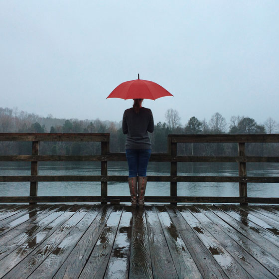
I also chose this as one of my favourites because it shows both muted and saturated colours. Clearly, the colour which we are originally drawn to is the red on the umbrella. The dull colours we do not really focus on because there isn't really anything major happening involving colours. This is good because they contrast against each other which prevents it from being too uninteresting to look at. The long range shot that this photographer has used, shows the contrasting colours better than a close up shot would. This type of shot allows room for people to take in the dull background and to compare it with the red umbrella. The individual standing with the umbrella, is even wearing clothes consisting of muted colours which is more effective than if they were to wear bright vibrant coloured clothes.
Friday, 23 September 2016
Colour straight images

I chose this photo as one of my best because I like the way it shows muted colours such as the dull grey and off - red colour. I also like the angle of the photograph and instead of taking a close up shot of the colours I took it from a long distance away and pointed the camera upwards. The muted colours may have presented a boring side to the photo and therefore, I think that taking the photo from this angle prevented it from being too boring. If I were to retake this photo, I would take it at a different angle to prevent the background from being too over powering and cancelling out the muted colours.

This photo is one of my favourites because I like how the colours are intense and very saturated. I also like how the balls are unintentionally set out in a way which compliments each other - there are none of the same colour which are next to each other. I also like how there is no background colour which interferes with the intense colours. The objects are of a wide variety of colours and is a more intriguing way of showing saturated colours rather than just photographing a painted surface.
I chose this picture as one of my favourites because the blue and yellow contrast well with the muted colours in the background. This picture fits well into the topic of colour because it consists of both saturated and muted colours. The blue lid and the yellow liquid contrasts well with the dull background. I also like how it is positioned - I think this is more interesting than just photographing a picture of a bottle standing against a dull background. A close up shot mess that I could capture the bright colours against the background completely, without anything interfering.

This picture consists of analogous colours: red and green. The individual colours work well together and both stand out. I like how the background is bright which makes the whole picture brighter in general. The colour red links to warmth and the colour green links to nature which I think this photo links to well.
Colour Work Diary
Planning

Evaluation and Progression
My focus for this topic was colour and all different types of colour. I also looked at muted, saturated, analogous and complementary colours. When looking for objects to take images of, I took all of this into account and took a variety of images to show I understood different types of colours. I looked for objects which I could take pictures of that would present colour in a more interesting light.

The colours in this photo such as red and green, are complimentary colours. They work well together and each colour stands out in contrast to the opposite colour. I like this image because the focus is good which is ideal for a good photograph showing colours, especially ones which contrast each other. The colours are saturated and vivid - they are bright and intense. I like how the background is bright also because this means that there is not too much else to focus on. It also ensures that people do not get distracted by any other colours other than red and green, when looking at the photo. If I were to take this picture again, I may take it at a different angle, to capture more of the colour red within the photo. This is because I feel as if although this picture works well with the topic of colour, that there could be more of the colour red. I think that this would make the picture better because there would be even more contrasted colours within it. I also could take it at a different angle to ensure that there is no background showing. The background works well with the colours however, it could make the picture better if there was no background in view.

 This photograph shows muted colour such as the grey and off red colours. I think that the muted colours on the building contrast well with the blue sky in the background. However, to improve this image I could make the muted colours deeper because I think the bright background over rides the muted colours shown on the building which makes it hard to focus on the other colours. I also think that if I were to take this again, I would take it at a different angle - trying to cut out most of the background and any other objects that are seen in the image. This is because the muted colours which I aimed to show, are not dominant and instead the background is. I like the fact that there are different tones of the muted colours. For example, there are some light grey tones and some dark grey tones. This adds more to the picture because it means that there isn't just two block colours. This picture is almost depressing due to the lack of saturated and intense colours - it creates a sense of darkness and unhappiness.
Progression


Evaluation and Progression
My focus for this topic was colour and all different types of colour. I also looked at muted, saturated, analogous and complementary colours. When looking for objects to take images of, I took all of this into account and took a variety of images to show I understood different types of colours. I looked for objects which I could take pictures of that would present colour in a more interesting light.

The colours in this photo such as red and green, are complimentary colours. They work well together and each colour stands out in contrast to the opposite colour. I like this image because the focus is good which is ideal for a good photograph showing colours, especially ones which contrast each other. The colours are saturated and vivid - they are bright and intense. I like how the background is bright also because this means that there is not too much else to focus on. It also ensures that people do not get distracted by any other colours other than red and green, when looking at the photo. If I were to take this picture again, I may take it at a different angle, to capture more of the colour red within the photo. This is because I feel as if although this picture works well with the topic of colour, that there could be more of the colour red. I think that this would make the picture better because there would be even more contrasted colours within it. I also could take it at a different angle to ensure that there is no background showing. The background works well with the colours however, it could make the picture better if there was no background in view.

To improve this image, I used Photoshop to adjust the contrast, saturation and brightness to make the colours stand out against each other even more. They are now extremely saturated and intense which makes the colours even easier to focus on. The dominant colour is red and by improving the picture on Photoshop, it has made the colour red especially brighter. I only make subtle adjustments to this photo because I felt like it worked very well already. I cropped out some of the photo because with the adjustments that I had made, some of the berries had become barely visible and I thought that this spoiled the intensity of colour of the the berries. 

Evaluation
 This photograph shows muted colour such as the grey and off red colours. I think that the muted colours on the building contrast well with the blue sky in the background. However, to improve this image I could make the muted colours deeper because I think the bright background over rides the muted colours shown on the building which makes it hard to focus on the other colours. I also think that if I were to take this again, I would take it at a different angle - trying to cut out most of the background and any other objects that are seen in the image. This is because the muted colours which I aimed to show, are not dominant and instead the background is. I like the fact that there are different tones of the muted colours. For example, there are some light grey tones and some dark grey tones. This adds more to the picture because it means that there isn't just two block colours. This picture is almost depressing due to the lack of saturated and intense colours - it creates a sense of darkness and unhappiness.
 Progression

I only wanted to make small changes to this photograph because I felt like nothing major should be done to make it better but would take in account how I would retake the picture if I had the chance. I adjusted the Exposure, offset and gamma correction. There isn;t much difference to the photograph but I think that the background looks less dominant than before and you focus more on the muted colours on the building. This picture doesn't work as well as other pictures because I should have taken it at a better angle but I do think that it is still effective.

Evaluation
 I like this photo because there is no background space and it is filled with colour. All of the colours are very intense and saturated. There is a wide variety of colours in the photograph which is why it's one of my favourites. I also like how the balls have unintentionally been placed in an order which works well - there are none of the same colour next to each other. The colours are bright which make it exciting and each individual ball stands out - there is no specific ball which is brighter than the other. The variety of colours within the picture create a happy effect.
This photograph needed barely any adjustments done to it. However, I used Photoshop to make it even more saturated and vibrant. Each individual ball stands out even more and the colours are stronger/deeper. This gives me a strong sense of happiness and personally, I wouldn't do anything else differently to take this photograph. There is no interference with the colours which I had in some of my previous photographs which is why this fits so well with the subject topic of colour.
 Progression

Evaluation
 I like this photo because there is no background space and it is filled with colour. All of the colours are very intense and saturated. There is a wide variety of colours in the photograph which is why it's one of my favourites. I also like how the balls have unintentionally been placed in an order which works well - there are none of the same colour next to each other. The colours are bright which make it exciting and each individual ball stands out - there is no specific ball which is brighter than the other. The variety of colours within the picture create a happy effect.
This photograph needed barely any adjustments done to it. However, I used Photoshop to make it even more saturated and vibrant. Each individual ball stands out even more and the colours are stronger/deeper. This gives me a strong sense of happiness and personally, I wouldn't do anything else differently to take this photograph. There is no interference with the colours which I had in some of my previous photographs which is why this fits so well with the subject topic of colour.

In my opinion, this is one of my worst photos that I took to represent line. This is because I don't like the angle that it was taken at. The image wouldn't be so bad if I had taken it as a long distance shot - I don't think it works well with the subject of colour. However, I do like the red against the black background because I think that these colours contrast majorly so therefore, I think that this image would be effective in showing colour if I had taken it from a different angle. To improve on how I take my photographs to ensure that they work well with the topic, I should take several shots of the same object but from different angles and distances. this would also make my pictures more interesting rather than just looking at a picture that was taken from head - on. I could have also used a tripod to take this photo to prevent it from being on a slant. This would ensure accuracy of the lining in the photo.
Monday, 19 September 2016
Colour Definitions
Colour - Colour is the element of art that is produced when light, striking an object, is reflected back to the eye. There are three properties to colour. The first is hue, which simply means the name we give to a colour (red, yellow, blue, green, etc.). The second property is intensity, which refers to the vividness of the colour.
 I chose this photo because I like the way that here is a group of flowers however, only one flower is coloured. This makes me feel like the flower that is pink, is the only one which is actually alive. This is because when you think about flowers, you wouldn't think about them being black and white (they're usually pretty, bright colours).
Psychology of colour


Red - suggests physical courage, strength, warmth, romance and excitement. However, in it's negative light it could suggest violence, strain and defiance.

Yellow - implies optimism, confidence, self - esteem, extraversion, emotional strength, friendliness and creativity. It's negative side may suggest fear, irrationality, depression, anxiety and emotional fragility.
(I agree with this colour definition however, I think it also represents happiness and new life. I also do not think that it represents depression, fear, anxiety or emotional fragility. Looking at the colour yellow gives me a sense of happiness and does not make me feel sad or fragile in any way).


I think that the colour purple is a hard colour to pinpoint a specific meaning to. However, I think that this image is good at representing luxury. The dress looks almost royal

 This picture makes me feel happy and refreshed. The yellow colours in the picture suggest confidence and self esteem, clearly shown by the woman in the picture. The colours in the picture are very bright - they suggest happiness and control. The children in the photo look like they're enjoying themselves and that it is a happy scene.
Muted colours - When you take a colour tone, and you mix it with white or grey, it dulls it down to make the colour less. bright or in other words it makes it muted or mute.
Saturated colours - Colour saturation refers to the intensity of colour in an image. In technical terms, it is the expression of the bandwidth of light from a source. The term hue refers to the colour of the image itself, while saturation describes the intensity (purity) of that hue.

This picture is a good example of analogous colours. The colours in this picture are red, orange and yellow. These colours work well together and 'get along'.
 This picture is a good example of complementary colours. The colours in this image are red and green. Quite obviously, the colour which stands out is the red. This is because the colours red and green are opposite to each other on the colour wheel and therefore each separate over stands out more. In the picture above, the individual colours stand out less than the colours in this picture due to the fact that the colours above are analogous.

Psychology of colour

This picture fits well with the idea that the colour blue represents depression or a sad mood. The man walking alone is dressed in black which can also be implied as a sad colour. The fact that he is alone and the atmosphere is blue could suggest that he is sad or alienated.
Blue - suggests coolness, distance,
spirituality, or perhaps reserved elegance. Some shade of blue is flattering to
almost anyone. In its negative mode, we can think of the "blues"-the
implication being one of sadness, passivity, alienation, or depression.
This picture works well with the idea of red being connected to romance. A red rose is stereotypically linked to love and relationships.
Red - suggests physical courage, strength, warmth, romance and excitement. However, in it's negative light it could suggest violence, strain and defiance.

Looking at this picture of a yellow filled field makes me feel happy and 'summery'. Even though the sky is dark, I still feel a sense of happiness. I do not think that the picture implies fragility or depression at all because the field is complete and perfect - it is a block of yellow.
Yellow - implies optimism, confidence, self - esteem, extraversion, emotional strength, friendliness and creativity. It's negative side may suggest fear, irrationality, depression, anxiety and emotional fragility.
(I agree with this colour definition however, I think it also represents happiness and new life. I also do not think that it represents depression, fear, anxiety or emotional fragility. Looking at the colour yellow gives me a sense of happiness and does not make me feel sad or fragile in any way).

I think that this image is a good example to represent the colour green because it represents nature and life. However some people may suggest that this also applies to the bland side of the colour green because there isn't very much going on in the photo. The trees are all alive which could give a refreshed feeling.
Green - Positive: Harmony, balance, refreshment, universal love, rest, restoration, reassurance, environmental awareness, equilibrium, peace.
Negative: Boredom, stagnation, blandness, enervation.
I think that the colour purple is a hard colour to pinpoint a specific meaning to. However, I think that this image is good at representing luxury. The dress looks almost royal
Purple - Positive: Spiritual awareness, containment, vision, luxury, authenticity, truth, quality.
Negative: Introversion, decadence, suppression, inferiority.
Orange - Positive: Physical comfort, food, warmth, security, sensuality, passion, abundance, fun.
Negative: Deprivation, frustration, frivolity, immaturity.
Pink - Positive: Physical tranquillity, nurture, warmth, femininity, love, sexuality, survival of the species.
Negative: Inhibition, emotional claustrophobia, emasculation, physical weakness.
Negative: Inhibition, emotional claustrophobia, emasculation, physical weakness.
Grey - Positive: Psychological neutrality.
Negative: Lack of confidence, dampness, depression, hibernation, lack of energy.
Black - Positive: Sophistication, glamour, security, emotional safety, efficiency, substance.
Negative: Oppression, coldness, menace, heaviness.
This picture can be interpreted as showing sadness because of the blue shade shown. The woman in the photo doesn't look happy and looks as if she has a lot on her mind (as if she is isolated). The woman in this image is Lily Allen who sings slow songs - this links with the somber mood that the colour blue creates.
 This picture makes me feel happy and refreshed. The yellow colours in the picture suggest confidence and self esteem, clearly shown by the woman in the picture. The colours in the picture are very bright - they suggest happiness and control. The children in the photo look like they're enjoying themselves and that it is a happy scene.
 Muted colours - When you take a colour tone, and you mix it with white or grey, it dulls it down to make the colour less. bright or in other words it makes it muted or mute.
Saturated colours - Colour saturation refers to the intensity of colour in an image. In technical terms, it is the expression of the bandwidth of light from a source. The term hue refers to the colour of the image itself, while saturation describes the intensity (purity) of that hue.
.
Analogous - Three of four colours that are next to each other on the colour wheel. They are also known as harmonious because they compliment each other and 'get along'. They have a soothing effect and are often used in visual design. 

This picture is a good example of analogous colours. The colours in this picture are red, orange and yellow. These colours work well together and 'get along'.
Complementary - colours are opposite to each other on the colour wheel, e.g.
Blue-violet and yellow, represent colours positioned across from each other on
the colour wheel. Complimentary colours exhibit
more contrast when positioned adjacent to each other.
 This picture is a good example of complementary colours. The colours in this image are red and green. Quite obviously, the colour which stands out is the red. This is because the colours red and green are opposite to each other on the colour wheel and therefore each separate over stands out more. In the picture above, the individual colours stand out less than the colours in this picture due to the fact that the colours above are analogous.
Subscribe to:
Posts (Atom)