Showing posts with label work diary. Show all posts

Sunday, 23 April 2017

Physical Images Work Diary

Evaluation and Progression


Evaluation

  Here is an example of one of the physical images I created. I gathered inspiration from the famous photographer Barbara Kruger and Pinterest. Here I took a portrait image of a female smiling. I edited it within Photoshop to put a black and white filter on it and also adjust the brightness and contrast settings. The reason for this was because the red highlighted phrase which I was going to stick across the image, contrasted better when the image was in black and white - it also related better to Kruger's work. Here I pasted the words 'we are not what we seem' across her face. I covered all of her facial features other than her mouth because I wanted her smiling expression to be visible. I chose to write these words because I wanted to outline the fact that no one truly knows what other individuals have happening behind closed doors or they do not know if how they seem is really how they are. I thought that these words worked well with the smiling expression she has because it makes us question if she really is as happy as she looks. I created this image by hand and then scanned it to get it onto the computer and into my blogger.

Progression


  Here is my final and edited image of the one previously shown. I used Photoshop to make some minor adjustments because I liked how the image worked already. Firstly, I cropped some of the wide edges around the main image out because this was negative space. This was due to the scanning of the image. I then adjusted the contrast and brightness of the image to try and introduce some darker tones. This was because the image consisted of many light tones and very little dark tones. Lastly, I used the 'curves' setting to again try to introduce more dark tones into the image. I am very pleased with the final outcome because there is more of a balance between the opposite tones. I think that this image successfully relates to the work of relevant photographers and is a good example of physical image making. I don't think that I would do anything particularly different if I were to remake this image.


Evaluation

  Shown here is another example of a physical image which I created. I again, used my photographer research and ideas from Pinterest to influence how I created this image and the words which I used. I took a picture of a female who holds and emotionless expression on her face. I chose to put the word 'obsessed' in the middle of the image, covering her face and the opposing words surrounding it. I consciously arranged the words this way because the surrounding words are the aspects which many women are 'obsessed' with. I wanted the picture to look cramped because it relates to how women may feel due to the many pressures they receive to be and look a certain way by the media and wider society - a women may feel trapped. Difference is disregarded of in society and therefore many women feel obliged to fit the idea of being 'perfect' which includes have a certain body type, looking and being feminine at all times and looking presentable when in company.

Progression


  Here is a my final edited image of the one presented above. Again, I only made some minor adjustments because I already like the way that the image worked. I made similar adjustments to the previous image because they both required the same changes. I used Photoshop to firstly crop the image because similarly, there was negative space from where I had previously scanned the image. This meant that the image is now more centred and the focus point is more vivid. I then made the image darker and the tones more contrasted because again, the original unedited image consisted of a large amount of light tones and little dark tones. I lastly used the 'curves' setting within Photoshop to darken the dark tones within the image so that there was more of a balance between the two. I am very happy with the final outcome because I think that it relates well with the work of Barbara Kruger. I don't think that I would do anything particularly different if I were to remake this image because I think that it is a successful piece of work.


Progression

  To progress my work further, I should complete more physical images which differ to these two. I could possibly photograph a different individual or a different scene, which would add some variation to my physical image work.

Sunday, 29 January 2017

Composite Image Making Work Diary

Planning

Evaluation

   
  Here I took two images: one a playing card which was photographed against a plain background in the studio and another which is a landscape which I took in London which we can see the London Eye presented in. I wanted to put these images together because I think it would create an interesting look. Using playing cards to play games at family parties for example, Christmas could be perceived as a British activity. This is why I liked the idea of merging these two specific images together because London is a popular place which is well known. I thought that the image of the London eye which I had taken held a good amount of space to place the picture of the playing cards in there. I liked the fact that there were people in the landscape because it makes the picture more abstract.


Progression


   To create this image I used Photoshop to  combine the two images together. First, I had to rotate the images of the cards and crop an edge off because I wanted it to seem as if the cards were stuck into the floor. I then copied and pasted the images of the cards onto the background of London. I made the cards fairly large because I wanted it to look as if they were as big/ bigger than the people standing in the landscape. I like this image because the cards look solid and stuck into the ground which I feel, makes people look twice to question if they are supposed to be there. Also, I like this image because it almost reminds me of a fantasy lifestyle.


Evaluation


   Pictured here is two images which I took to complete the following image: one of a bouncy ball which is alumnus yellow with black spots and another of a grain station. I thought that these two images would work well together because the image of the train station is dark and consists of muted colours where as the bouncy ball is a saturated yellow colour. Furthermore, I thought that these would contrast and create a good composite image. The train station is quite empty in this case and therefore I thought that it would be a good opportunity to work with this image.


Progression


  Here I used Photoshop to create this composite image. I used the quick selection tool on Photoshop to cut out the object which I wanted to place onto the background. I then copied and pasted it onto the image of the train station. I arranged several copies on the bouncy ball in a way that looks like they are falling and bouncing around the image. I really like the final image because the two corresponding images contrast against each other. To progress this image further, I could try out different backgrounds and create some variations of this image.

Progression

    I think that I could progress this image by exploring different objects rather than the ones previously used - possibly more unique and abstract objects and place them on more unusual backgrounds to really create a set of images which show my full potential within this project.

Sunday, 1 January 2017

Documentary shoot One Work Diary

Planning


Evaluation and Progression

Evaluation


  I chose this image as one which I wanted to explore and progress because I like how this shows London from above and because it is not something I would usually photograph. I took this image on the London Eye which is a popular place in London. It shows the city from high which means that people can see across London. I therefore seized this opportunity to capture a great landscape image whereby the extremely built up city can be seen. I like this image because you can see the Big Ben which is another popular object in London. Due to there being so many popular places in London which large groups of people visit daily, it means that the city is constantly busy. I wanted to photograph this because from what we can see of London from above, there are buildings/houses covering the entire area which again highlights just how busy the city is.

Progression

      To edit this image, I used Photoshop to enhance the colours because the original image was too dark and it was hard to see the buildings well. I had noticed that the colours were very plain and muted, even the water was a grey colour. The colours we may see in a rural environment such as greens, oranges, yellows etc such as in forests are not visible here. There are barely any trees or greenery as everything has been built upon. Furthermore, there is not really any interesting colours presented here as they are all dull blues, greys, browns etc. Therefore, I adjusted the vibrancy, exposure, saturation and brightness options on Photoshop. This has made the buildings more outlined and made the picture brighter as a whole. I like the developed image because it is a good landscape of London from above.


Evaluation


  I took this image in Canary Wharf, London. This is another popular place in London which again, many people visit daily. I like this image because of the orange tones in the skyline. I also like how the buildings are arranged against the skyline which acts as a good background. I like how the picture is fairly dark but the background illuminates the outlines of the buildings. I also like how we can not see any details of the buildings because it prevents us from distractions and helps us to focus on the buildings as a whole and what they mean. There are lots of cars parked and a group of buildings in the background which suggests that even in different parts of London, it still is busy and built up. I like this landscape because it looks like something which would be used as a picturesque background.

Progression

           
  To develop this image further, I used Photoshop to adjust the colours because although I liked the dark mask in the picture, I wanted the orange tones in the skyline to be vivid also. I liked the edited image better because the buildings are darker but the background is brighter which makes a better base of the buildings' silhouettes. I also cropped out the moving car from the image because I felt like it was unnecessary in being there. It split the image up which is not what I wanted to the image to present because it distracted us away from what I wanted the eye to focus on. If I were to take this image again, I would possibly try to get closer to the buildings, to the point where I could still present them against the skyline but cut out distractions.


Evaluation


  This image shows one of London's many busy underground train stations. A large amount of people use train services daily. In the picture, there are crammed escalators and many people are rushing to reach their destination. I wanted to take an image such as this one to present life in a busy city like London, not only because it is not a typical picture of the buildings/tourist attractions, but because it shows how there is a high demand surrounding train/bus services due to London being such a wide spread, highly populated area. Here you can see that there is little space to manoeuvre because of how busy it is. I like this image because I was able to capture how busy the underground stations in London can be on an ordinary day. I was also able to capture a small amount of motion blur because people were rushing and walking fast.

Progression


  To progress this image, I used Photoshop to make only subtle adjustments to it such as: turning it into black and white, making the vibrancy higher and making it more contrasted. I think that the black and white version of this image is better at presenting the business of the underground station because it merges the commuters together rather than our eyes focusing of certain individuals. Our eyes are also better lead towards the centre of the picture and therefore, the busy escalators. The black and white I think, also highlights the emotions the people are displaying. For example, we may now notice the fact that there is no one in sight who is actually smiling, possibly because everyone is rushing to where they want to get to.

Sunday, 4 December 2016

Potraiture Work Diary

Planning


Evaluation and Progression


  I like this image because I like how there is no expression on her face at all. I was inspired by the photographer Thomas Ruff who photographed individuals against a plain background, wearing ordinary clothes and remaining totally emotionless. I think that this is a interesting way of photography people because we can only see the surface (the outside of someone and the emotions they are showing etc) and we cannot take anything specific from this image. Furthermore, we cannot know for definite what the person is thinking and even is she was smiling while the picture is being taken, how can we really know for sure that they are happy? This is an example of a head shot which I took in a studio using soft lighting, an ISO of 200 and a low f stop.

Progression


      To edit this image, I used Photoshop to crop some of the image out, as there was a black object in the upper right corner. I also adjusted the saturation, vibrancy, contrast and brightness. With these subtle adjustments that I have made, I feel that the colours have been brought forward more and her facial features are more defined. This ensures that the emotionless expression she is portraying is eye catching. If I were to take this image again, I may do a closer shot of the face so that the facial expressions are the main focus rather than anything else. I could also use different coloured backgrounds (like Thomas Ruff did) and see if they present a different mood.


Evaluation


  I chose this image as one which I wanted to focus on and edit etc. because I like how there are props being used and the expression she is showing. This image is very different to the one shown above. It is an example of a half body shot which was suitable in this situation because we are able to look at her body language and how it differs from the image above. I like this image because it allows us to know more about her as an individual. Furthermore, her own individual personality is shown here for example, the way she is holding the props and her body language is not rigid. She looks more relaxed than the person in the picture above. However, in my opinion this is less interesting than the picture above because there is a limit of what we can take from this image. For example, we may just think that she is having fun and is happy due her smiling etc. and we tend to think no further about the expressions she is showing.


Progression


  To edit this picture, I used Photoshop to make some adjustments surrounding the vibrancy, contrast and so on. I feel like this had made the picture more vivid and the features of the picture more defined. The different tones are contrasted better. I also progressed this image by changing it into black and white and adjusting the curves settings which I think has added further to the vividness and contrast of the tones. I also use the 'patch tool' setting to remove any imperfections within the background which has made the image look tidier. If I were to take this image again, I would use different coloured backgrounds and see which works best with the sense of happiness I was trying to convey in this image.


Progression


  I chose this image as one which I should aim to improve because I wanted to take photographs for portraiture photography which were similar to the style of Thomas Ruff. The picture to the right does not really work with what I wanted to achieve. I needed to take images which were head shots rather than half body shots, to really focus on the facial expressions. Her head is slightly off centre here too.


Further Progression


    Here I took a image to show further improvement and progression within this topic of portraiture. I photographed her in dark lighting because I like the contrast of light and dark on her body. I think that I have made an improvement in the way that I take portrait images. I tried to photograph using different angles, lighting, camera settings etc. I really like how her face is defined by the warm orange reflections. I could use Photoshop to edit this image to present further progression.

Thursday, 24 November 2016

Landscape Work Diary

Planning


Evaluation and Progression

Evaluation


  I chose this image as one which represents landscapes well because I like the colours and how the trees are bare and we can therefore see segments of the sky in the background. This creates a really picturesque landscape which is calming and quiet. Vertical lines represent strength and power which goes well with the idea of trees (production of oxygen) as an essential for everyday life. The trees are long and tall which presents a sense of strength. I like the angle which I have taken this at because the trees lead us to the top of the picture.

Progression 


  To progress this image, I used Photoshop to adjust the exposure, saturation, gamma correction and contest. This made the autumn colours in the trees really stand out as they were originally quite dull and dark. This image now makes me feel warm due to the orange and yellow tones. they stand out against the white background. The lines represented in the picture are more prominent. I really like this image because the colours are intense which portrays the wide variety of colours we see in autumn.  

Evaluation


I like this image because the long pavement means our eyes are led towards the end of the picture. I also like how the picture looks simple and tidy but is still effective. I like the mixture between greens and yellows however, I think that I should convert it into black and white because the colours here are darkened due to the overcast sky. 
  
Progression

   
  To progress this image, I used Photoshop to convert it into black and white. I think that this works better because it highlights the tones in the picture better. I used the dodge tool in Photoshop to highlight specific areas within the picture. I also used the burn tool to darken some areas of the sky. I have consciously made adjustments which are more effective in 'leading' our eyes to a certain area. I think by using these tools, it has created a picture which represents landscape from a different perspective.  If I were to the this image again, I would take it more centre orientated so that our eyes lead straight into the end of the picture.              

Evaluation 


I like this image because it is different and is not something people would usually think represents a landscape. I like the damp patches on the floor because they are reflective of the light above. This picture has an opposite effect to the alternate images because it does not supply me with a warm feeling. This is because the colours here are very bland and cold, unlike the warming oranges and yellows. However, I like this picture because it presents landscape photography in a different way.

 Progression


   I made subtle adjustments to this image using Photoshop because I think that it worked very well previously. However, I used Photoshop to change it into black and white, adjust the contrast, curves, exposure and offsets settings. I think that these changes work well because the black and white is well suited to the damp and cold nature that this image portrays. I also used the dodge tool to highlight some particular areas which I wanted to be more highlighted and I used the burn tool to create shadows in areas which I wanted to be darker. This image contains a range of tones and portrays landscape effectively and intriguingly. If I were to take this picture again, I could use a tripod to steady the camera while taking the image at a lower angle.


Progression


 I chose this image as one which should be adjusted or retaken because I do not think that it accurately presents landscape. I think that it is uninteresting and should be taken at a better angle. I could maybe use a tripod to take an image at a accurate angle and maybe to get more of the building and landscape in. I went back to retake this image (shown below). I think the mage shown below does work better than the one previous however, I would need to make some adjustments using Photoshop using crop, contrast , curves and so on to improve the appearance of the picture. I could also turn it into black and white as I do not like the colours presented in this picture.


Tuesday, 22 November 2016

Joiners Work Diary

Planning

Evaluation and Progression


  Here I used Photoshop to create a more unique joiner. I like this because I have layered different images on top of the original images which include his face/body from different angles. I adjusted the capacity setting on Photoshop which helped me to create the fading effect on some particular images. I really like this joiner because it creates an illusion. I could possibly add further images to the joiner to make it more interesting.

Evaluation and Progression


  I used a similar technique as the joiner above when focusing on this one. I took small scale images of separate parts of her body in the studio. I then used Photoshop to make adjustments to each of the smaller photos before I merged them all together to make this joiner. I joined images together which obviously did not match together accurately, which creates an illusion. I think that this piece of work is successful in showing my ability to use Photoshop to the standard in which I require. I like this joiner because it is not perfect, not every image is accurately matched with the corresponding one. 


Progression 

  To further progress this project I could try to use different objects to join together. For example, taking images of different parts of the flower and joining them together. I could also try to work with images of a building and join them together. This would add variety to my work rather than just photographing people. 


Monday, 14 November 2016

Framing work diary

Planning


Evaluation and Progression


Evaluation

  I chose this image as one which I wanted to progress because I think that it has potential to be a great representation of framing photography in a unique and abstract way. The frame is the wooden edges in the foreground. I really like how the foreground is focused and the background is unfocused. The barbed wire creates a distinct sharpness. This image also ties in with the subject topic texture because the rough wooden frame and the sharp and vicious look of the barbed wire presents texture. The background contrasts with the sharp barbed wire and rough wood texture presented because trees and nature represent life, purity and growth.

Progression


  To edit this picture, I made the colours in the background more saturated and vivid. By doing this, it has created a more distinct background for the sharpness texture and shape of the barbed wire to contrast against. The picture is brighter as a whole which good in this case because it outlines the frame which we are looking through. I also adjusted the contrast, vibrancy, exposure and brightness because it was really effective in helping towards a picture which really stood out. It has brought the background to life which was originally unfocused and dark. Furthermore, overall it has brightened the picture and has made it more effective in showing framing of the background.


Evaluation


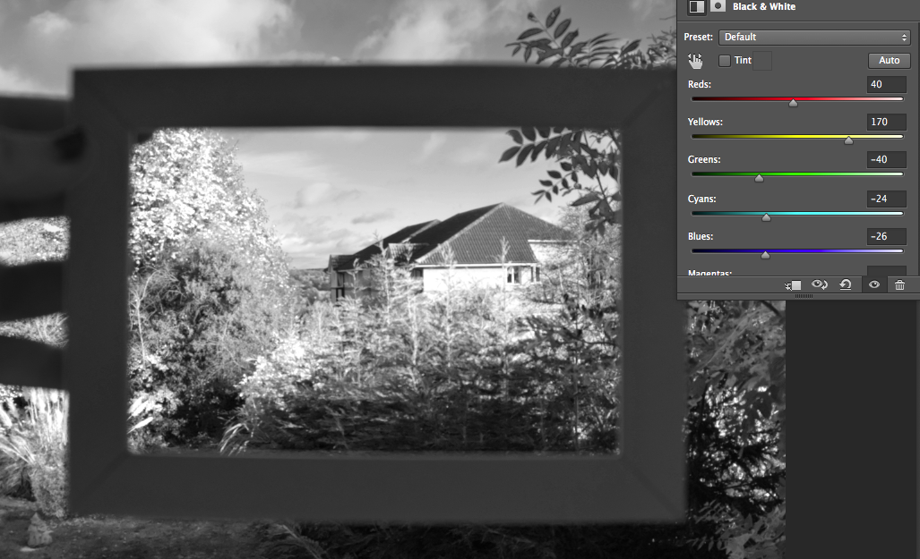
  Here I have taken the idea of placing a literal frame onto a background to represent framing photography in a simplistic but effective way. I took the idea from my image bank which I had gathered because it interested my how it is very basic but effective. I like how the the frame isn't that focused but the background presented within the frame is, causing us to look into the frame. A frame would usually hold a picture but in this case, the background is the picture within the frame. I like it because it creates confusion but interests you at the same time.

Progression 


   To progress this picture, I used Photoshop to change the picture into black and white and adjust the colour levels to create a more vivid picture through the frame. I then adjusted the vibrancy and contrast because the 'picture' see through the frame was not particularly vivid. I like how my hand is blurry and by changing it into black and white, we focus even less on the hand in the picture. This is god because our eyes are lead straight into what is represented within the frame.

Evaluation


  I chose this image as one which I wanted to progress because it extends further than the other images shown above. For example, it represents framing within framing. The frame in the foreground frames the background however, there are also frames within the background. Not only this, but there is more than one frame within the 'whole frame'. There are smaller, individual frames within the large frame. This is more effective because we can look through each individual frame and see different segments of a whole picture within small sections. I also like the metal look because it creates a thin outlined frame.


Progression

   To progress this image I used Photoshop to make subtle adjustments such as: the increase in saturation, vibrancy, exposure and contrast. The colours are now more drawing and saturated which makes the picture more interesting. I think that with the changes that I have made, the picture works really well and is an interesting take on framing photography. The angle works well with the objects also. If I were to take this picture again, I would maybe try to cut out some of the pavement and try to focus on getting more of the grass in the picture.


Progression


   I chose this image as one which I needed to progress or retake because I don't think that it works well with the subject topic of framing. The frame is too wide and it is hard for our eyes to be drawn into the image that I was meant to frame. There are too many distractions such as the diamonds on the object which we are lead to. I could possibly take this image again but at a different angle to ensure it doesn't look muffled and rushed.