 This image consists of flowers - some which are in black and one and one specific one which is in colour. This is an intriguing use of colour because the flower consists of analogous colours (red and orange). It also uses a colour splash technique which is the main focus of the picture. The background in blurred and the flower, which is in the foreground is in focus. In my opinion, this photo is extremely interesting because it consists of three participants which make a good photograph - the colour splash, the unfocused background and the analogous colours. The use of colour splash links well with the topic of colour which I am currently looking at because it instead of the whole photograph being coloured, only one flower is coloured which makes people look at the colours in the individual flower, rather than all of the flowers as a whole. It also works better than just one single coloured flower being in the photograph alone because I feel as if the colours would not be focused on as much as they would be within this photo. The photographer has consciously taken and edited this image in this particular way to present how colour can be shown in more of an effective way than just taking a photo of something colourful.
I chose this photo as one which inspired me. The photo consists of the colours red and green which are complimentary colours: green which implies refreshment, nature and possibly blandness and red which represents anger, strength and warmth. Due to the fact that the colour red is such a strong colour and green could be implied as bland, I think this is why the colour red in this picture is the dominant one - it stands out a lot more than the green grass and is the first colour which our eyes are drawn to. The red in this photograph is so strong against the green, that it is easy to ignore the fact tat this photo also consists of some yellow in the background. The colour red seems more saturated and vivid than the green. However the red could be edited to be even more saturated, contrasting the two colours further, I could use this idea of contrasting red and green against each other in future photographs which I will take.

This photo consists of muted, dull colours. It is not the photo itself which is uninteresting, but the colours which it consists of which make it gloomy. I think that the scenery works well with the colours because it is fairly bare and creates a 'depressing' mood. The trees are no longer alive and lack emotion, which a green and alive tree would have. Furthermore, I think that the photographer has consciously paired the bare scenery and the muted colours together to further outline the effect that this can create. The colour grey could imply lifelessness and although the colour green which could represent refresh-fullness is incorporated into the scenery, it is not saturated which does not give me the refreshed feeling which it implies. Within the subject of colour, I will possibly use this idea of inking nature and muted colours together because it really shows a different side to colour.
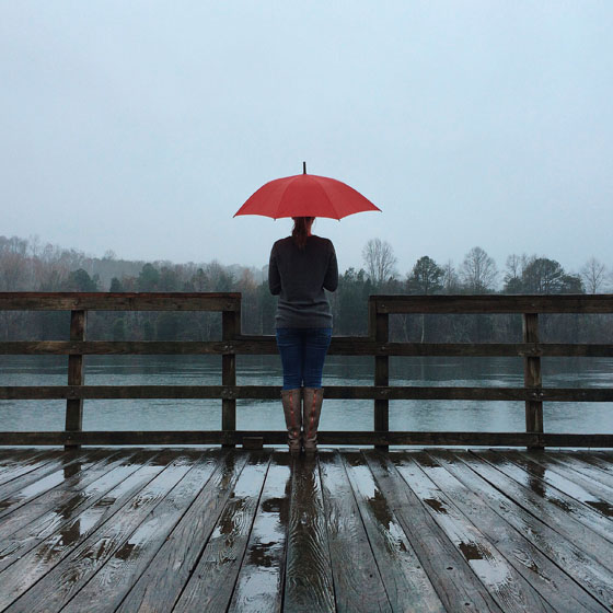
I also chose this as one of my favourites because it shows both muted and saturated colours. Clearly, the colour which we are originally drawn to is the red on the umbrella. The dull colours we do not really focus on because there isn't really anything major happening involving colours. This is good because they contrast against each other which prevents it from being too uninteresting to look at. The long range shot that this photographer has used, shows the contrasting colours better than a close up shot would. This type of shot allows room for people to take in the dull background and to compare it with the red umbrella. The individual standing with the umbrella, is even wearing clothes consisting of muted colours which is more effective than if they were to wear bright vibrant coloured clothes.
Very good detailed annotation and analysis... you might also comment on why red was used for the umbrella from colour theory.
ReplyDelete