Evaluation and Progression

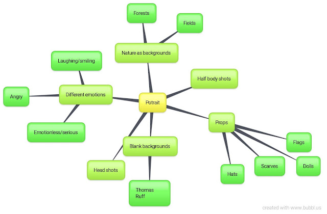
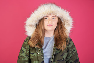
I like this image because I like how there is no expression on her face at all. I was inspired by the photographer Thomas Ruff who photographed individuals against a plain background, wearing ordinary clothes and remaining totally emotionless. I think that this is a interesting way of photography people because we can only see the surface (the outside of someone and the emotions they are showing etc) and we cannot take anything specific from this image. Furthermore, we cannot know for definite what the person is thinking and even is she was smiling while the picture is being taken, how can we really know for sure that they are happy? This is an example of a head shot which I took in a studio using soft lighting, an ISO of 200 and a low f stop.
Progression
 To edit this image, I used Photoshop to crop some of the image out, as there was a black object in the upper right corner. I also adjusted the saturation, vibrancy, contrast and brightness. With these subtle adjustments that I have made, I feel that the colours have been brought forward more and her facial features are more defined. This ensures that the emotionless expression she is portraying is eye catching. If I were to take this image again, I may do a closer shot of the face so that the facial expressions are the main focus rather than anything else. I could also use different coloured backgrounds (like Thomas Ruff did) and see if they present a different mood.
Evaluation
Progression


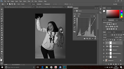
To edit this picture, I used Photoshop to make some adjustments surrounding the vibrancy, contrast and so on. I feel like this had made the picture more vivid and the features of the picture more defined. The different tones are contrasted better. I also progressed this image by changing it into black and white and adjusting the curves settings which I think has added further to the vividness and contrast of the tones. I also use the 'patch tool' setting to remove any imperfections within the background which has made the image look tidier. If I were to take this image again, I would use different coloured backgrounds and see which works best with the sense of happiness I was trying to convey in this image.
Progression

I chose this image as one which I should aim to improve because I wanted to take photographs for portraiture photography which were similar to the style of Thomas Ruff. The picture to the right does not really work with what I wanted to achieve. I needed to take images which were head shots rather than half body shots, to really focus on the facial expressions. Her head is slightly off centre here too.
Further Progression

Here I took a image to show further improvement and progression within this topic of portraiture. I photographed her in dark lighting because I like the contrast of light and dark on her body. I think that I have made an improvement in the way that I take portrait images. I tried to photograph using different angles, lighting, camera settings etc. I really like how her face is defined by the warm orange reflections. I could use Photoshop to edit this image to present further progression.


No comments:
Post a Comment