Saturday, 18 February 2017

Documentary Shoot Two Work Diary

   Planning


Evaluation and Progression

Evaluation


  Here I took an idea from my mind map of taking photographs of forests as showing rural life. When living in a rural area, there are forests located in close proximity and therefore, it is not uncommon to see here. In an urban area, such as London which I had previously photographed, most of the rural life has been destroyed due to demand of housing and buildings. Furthermore, there would not be particularly many forests such as this one when walking the streets of somewhere such as London. I like this image because the trees create a natural walkway for visitors to walk down and I like the fact that it creates a calming effect due to the muted colours and overcast sky.


Progression

  To progress my work, I used Photoshop to make only subtle adjustments because I think that the original picture worked well. I made adjustments to the saturation, contrast, curves and exposure settings here. The colours have been intensified and the picture generally looks brighter and better. If I were to take this picture again, I would maybe use a tripod and try to capture more of the tree length in to add depth to the image.


Evaluation
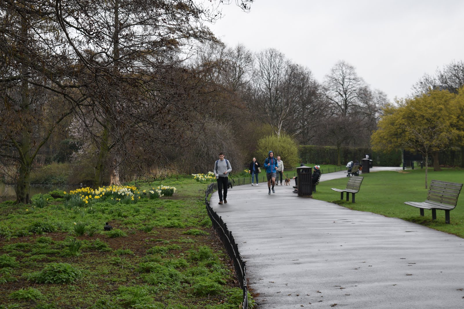
Here is an image that I took in a local park / pond area near to where I live. I really like this image because I have also captured people walking here. This adds some variation to my work within this project - instead of just capturing snapshots of empty rural areas, I have captured some action and movement in the scene. This particular area in somewhere where many individual come to relax, walk their dogs etc due to is being very calming and quiet. I like how it is not centred and path is offset. . It would be unusual to find somewhere such as this in a urban area such as a busy city such as London. Most of the space is built up with roads, houses, buildings, tourist attractions etc and there is not as much greenery or life within these areas.

Progression


   Here is my final edited image of the one previously shown. I used Photoshop to make some only small, subtle adjustments to this picture because I really liked it how it was. I adjusted the contrast and vibrancy of the colours which made them more vivid. I also adjusted the brightness and exposure of the image to make the people in the distance more visible. I like the final image better than the original one, despite only small adjustments being made. I like how the colours such as the green grass and the dashes of yellows from the planted flowers are now more saturated and vivid. This really highlights the beauty of an urban area such as this one. I don't think that I would do anything particularly different if I were to reshoot this image because I really like the final outcome. I feel like I really took my time when thinking about many things which build a good photograph such as composition, angle lighting and camera settings when taking this image.


Evaluation

    Here is an image I took of a small pond near to where I live. People come here regularly to feed the ducks and just relax in an environment away from drama etc. Small pond areas such as this one are not uncommon to see in rural areas like where I live. In the background, some houses are visible. If you were to travel to an urban area such as London, it would be rare to come across a small pond area like this one within a housing estate. I like the reflection of the surrounding trees on the pond. There is not much of a variety of colours in this image. I should edit this image in Photoshop to improve how visually pleasing it is.

Progression


   Here is my final edited picture to the one previously shown. I only made some very minor adjustments here because I liked how the original picture worked. I made the image brighter using the 'brightness' setting on Photoshop because I felt as if the previous image was very dull and dark, possibly due to the overcast sky on this particular day. However, I only adjusted this slightly because I felt like that this was all that was needed. I contrasted the tones more using the 'contrast' option on the editing program. I also adjusted the vibrancy of the colours to make the green in the image stand out better because I felt as if they were very muted. It is clear that I have only made some small changes to the previous image but I think that they have been very effective in the presentation of the image. If I were to take this picture again, I would maybe take it at a different angle to try to let more natural light into the image - this would prevent it from being as dark.


Progression


   I chose this image as one which I would need to improve. I did not choose this particular image because I think that it is bad however I think that it may work better in another area of photography such as line photography, rather than landscape. This is because I have not really captured the type of landscape image here which I was aiming for. I think that the images previously shown are a better take on landscape photography.


Monday, 30 January 2017

Composite Image Making Straight Images


  I made this image by combining two images together using Photoshop. I took some pictures of cards in the studio and placed it on a background of London. I think that the idea of playing cards and London as a destination work well together because cards may firstly be classed as more of a British game. I like how the cards look life sized and one even looks bigger than the surrounding people. I used Photoshop to crop an edge of the card so it looks like it was sticking out of the ground. I like this image because the cards look solid and large in size (even though we are aware the they are actually flimsy and smaller than our hand in real life). I could possibly try converting this into black and white  in Photoshop. 


Connecting Essay 4

Faye Godwin


  I chose this piece of work produced by Godwin because it is similar to my focus when looking at landscape photography. She loved to photograph pictures of natural land areas such as fields, forests and so on. I took a similar focus when looking at landscapes because I enjoy finding new areas which I can photograph. It opens up many windows rather than just photographing similar things such as buildings (they all look similar and therefore it would get boring). I like how she has found a spot whereby the pathway which is created by the separation of the trees is broke up by a fallen tree which curls round. She has shown how nature is unpredictable. Furthermore, by photographing static objects such as buildings, the shape/ presentation of them never changes where as, a photographer could walk through a forest and find several spots to take images which would all differ from each other.


 The image pictured to the right is one which I took when searching for interesting places to photograph which involved the presentation of natural land. I used Photoshop to switch the image into black and white to further represent similarities between mine and Godwin's work. This image is similar to the one shown above because I have captured a similar walk way whereby the trees lead into a pathway. I took a similar approach to that of the photographer by taking landscapes of groups of trees rather than individual ones. I also did not photograph the whole tree, mainly just the bodies of them as did Faye Godwin. I like this image because it has a mysterious feel to it because our eyes are lead towards the end of the 'pathway' created by the positioned trees which makes us want to devour deeper into the forest.

Connecting Essay 3

Imogen Cunningham


   I chose this image taken by Cunningham because she has taken a photograph of flower, which is an object popularly photographed due to it's representation of life and growth and she has added strong contrasting tones to highlight the form of flowers. I think that flowers are an interesting object to photograph within form photography because there are so many varieties and therefore they all hold different forms. For example, here each of the three flowers holds a different form because this is the way that they have naturally grown. Imogen has consciously presented the flowers in the light of such contrasting tones (bright whites and dark greys etc) to hide areas which were not important. I think that she is trying to encourage viewers to look at the smooth and unique form that the flowers hold rather than the details such as the colour of them or the details on the petals because we rarely acknowledge the natural shape each flower has and instead, we look at if it 'looks pretty'. The flowers all smooth and spiral shaped. I think that the close compact of the flowers create an all round more interesting effect than if we were looking at just a single flower. The dark background makes the white flowers stand out more.


   I chose this image from my selection of form/shape images to present the similarities between our work. Although the flowers in my image are a small amount brighter, it is easy to see the similarity between the extreme contrasted tones in each image. I also like this image of mine because the other flowers in the background are blurred, similar to Cunningham's work where the flowers further towards the back are less visible. You therefore focus on one or two individual flowers rather than a whole bunch (which we may be used to seeing more rather than singular flowers). Again, the dark background makes the flowers in the foreground stand out better due to the extreme contrast.

Sunday, 29 January 2017

Composite Image Making Work Diary

Planning

Evaluation

   
  Here I took two images: one a playing card which was photographed against a plain background in the studio and another which is a landscape which I took in London which we can see the London Eye presented in. I wanted to put these images together because I think it would create an interesting look. Using playing cards to play games at family parties for example, Christmas could be perceived as a British activity. This is why I liked the idea of merging these two specific images together because London is a popular place which is well known. I thought that the image of the London eye which I had taken held a good amount of space to place the picture of the playing cards in there. I liked the fact that there were people in the landscape because it makes the picture more abstract.


Progression


   To create this image I used Photoshop to  combine the two images together. First, I had to rotate the images of the cards and crop an edge off because I wanted it to seem as if the cards were stuck into the floor. I then copied and pasted the images of the cards onto the background of London. I made the cards fairly large because I wanted it to look as if they were as big/ bigger than the people standing in the landscape. I like this image because the cards look solid and stuck into the ground which I feel, makes people look twice to question if they are supposed to be there. Also, I like this image because it almost reminds me of a fantasy lifestyle.


Evaluation


   Pictured here is two images which I took to complete the following image: one of a bouncy ball which is alumnus yellow with black spots and another of a grain station. I thought that these two images would work well together because the image of the train station is dark and consists of muted colours where as the bouncy ball is a saturated yellow colour. Furthermore, I thought that these would contrast and create a good composite image. The train station is quite empty in this case and therefore I thought that it would be a good opportunity to work with this image.


Progression


  Here I used Photoshop to create this composite image. I used the quick selection tool on Photoshop to cut out the object which I wanted to place onto the background. I then copied and pasted it onto the image of the train station. I arranged several copies on the bouncy ball in a way that looks like they are falling and bouncing around the image. I really like the final image because the two corresponding images contrast against each other. To progress this image further, I could try out different backgrounds and create some variations of this image.

Progression

    I think that I could progress this image by exploring different objects rather than the ones previously used - possibly more unique and abstract objects and place them on more unusual backgrounds to really create a set of images which show my full potential within this project.

Wednesday, 25 January 2017

Connecting Essay 2

Ansel Adams


  This is a photograph taken and manipulated by Ansel Adams. His photographs of picturesque landscapes all contain a large range of tones. However, I chose this image because I like how the sky is filled with dark tones because I feel as if it creates a mysterious effect. I also like how the reflection of the sky on the water looks as if the picture has just been flipped and repeated because of the extremely clear reflection. It is hard to see the land in the distance because of the heavily overcast sky which makes the image more interesting. I like how the bright white tones in the sky are contrasted with one half of the sky which is heavily contrasted. I think Adams wanted to focus on landscapes when incorporating tones because in my opinion, they have a lot of potential to present a range of tones due to the natural contrasts within the environment. For example white snow laying upon a dark grey rocky mountain etc.


   I chose this image from my selection of work for tone photography because I think that the two images are fairly similar in terms of the sky. In this image there are heavy dark tones in the sky, as in the one above. In both images, the sky seems to go from darker to lighter as our eyes are lead further into the image. There are also bright white tones peeping through the overcast sky. I think that this image would have been better if I had took it as a landscape image rather than portrait because then the images would be extremely similar. In the image above, the photographers' idea was to obviously present natural landscapes and elements such as the sky. In my opinion, this is interesting because the clouds can move so quickly and within a matter of minutes, the picture would look completely different.

Connecting Essay 1

Thomas Ruff


  This image is one of many pieces of work produced by Ruff. Most of his work is based around the same idea which he never sways from. He photographed portraits of people mostly all in the same way. They were never smiling so remained emotionless, they wore ordinary clothes and they were photographed against a plain background. His portrait images therefore did not display any individuality. This is because he believed that a photograph could only show the surface of the object within it. Furthermore, by photographing them this way he swapped things around and actually made portrait imagery more interesting. For example, if we were to view an image whereby a person was smiling/laughing, we would automatically think that this person may be happy or in a good mood. However, they are more than likely portraying this emotion solely because the photographer told them to. Therefore, how do we really know that the person is really feeling happy? - they could really be feeling sad but smiling because this is what they have been told to do. Ruff therefore decided to photograph people as plainly as they could be. By doing this, it makes us think more about what they may be feeling on the inside. It opens a gate to many things which they may be thinking or feeling which we cannot simply tell. The image pictured above I feel is a good example because she is dressed in plain clothing which is a soft colour which is not bright (again not expressing individuality) and she is pictured against a white background which is also a similar colour to her clothing. She also has light coloured hair and pale skin which makes the image even more plain. Ruff really wants viewers to think deeply when looking at his images such as the one pictured above.


  I chose his image as one to represent the link between my own work and Ruff's work because I feel like it is easy to see the similarities between the two images that I have shown. Here, she remains totally emotionless, her skin is also pale and she is wearing ordinary clothes (she is not wearing anything to vibrant or she is not dressed smartly) so we cannot make assumptions surrounding her mood etc. I personally feel like because the background makes her pale face stand out, that we are led to her eyes which we focus on for some time, trying to figure out what it is that she is feeling. Similar to the image above, however hard we try, we simply cannot make assumptions surrounding her thoughts and feelings because there is little or nothing to work with. This image reinforces the idea that a picture show merely the surface of an object within a image.