Monday, 10 October 2016

Tone Definitions

Tone (definition).
This refers to the lightness or darkness of something. This could be a shade or how dark or light a colour appears.
Tones are created by the way light falls on a 3D object. The parts of the object on which the light is strongest are called highlights and the darker areas are called shadows. There will a range of tones in between the highlights and shadows.

Without tone Form does not exist, tone is therefore an important aspect in the visualisation of 3D objects.


          This photo shows tone very well. There are several different tones incorporated into this photo which we can find on the Ansel Adams Zone System. The light is reflected onto her dress where we see the patches which are highlighted. Her face has some dark tones and light tones where the light is reflected onto her face at different angles. 


  The tones shown in this photo are more masculine tones. This is because the dark tones on his beard and his t-shirt match with a male gender. The dark tones are more harsh which may refers to males more rather than females. 


   The tones are lighter in this picture which refers best to femininity. The soft light tones look more dainty and elegant which we stereotypically refer to a female. 


Pictoralism - Pictorialism is the name given to an international style and aesthetic movement that dominated photography during the later 19th and early 20th centuries.Almost looks old fashioned. Some brush stokes etc may be visible. 

Form Photographer Research

             Imogen Cunningham

 Imogen Cunningham was an American photographer who was well known for her form and nude photography. She photographed objects in a intriguing way, catching the eye of many people. She used shadow a lot during her form photography work which clearly has an effect of drawing people in. She focused a lot of living objects such as flowers; taking into account that she focused of form, living objects probably intrigued her because of the way they naturally grow and therefore, the form that they hold.


  This picture was taken by Imogen Cunningham and is of flowers. She is popularly known for her photographing of objects which represent form. The flowers are casted in different lightings - the flower at the back is barely visible and we can only really see the outline of the form. This outlines the fact that the details of the object are not really important, but only the form is. She has incorporated tone within her work to create dark shadows. The flowers present a spiral shape and they all roll into one. Most of Imogen's work is in black and white which creates strong and powerful contrasting effects.


This picture was also taken by Imogen and is again of a flower. The flower holds an unusual form and is hard to work out what type of flower it is. It again holds the spiral shape which is interesting to the eye. There are some serious contrasted tones here which is important when photographing form because shadows and lights and the intensity that they are can change the form of an object completely. For example, the bottom section of the photograph contains an intense shade of black; this makes it hard to work out what the object is because we cannot clearly see the form which it holds. There are other objects in the picture but they are not dominant. Objects such as the spikey plant are also intriguing to look at because they hold an unusual shape. Imogen has consciously picked out particular objects to photograph and positioned them in a specific way to create a photograph that draws people in.


Here is another example of Imogen Cunningham's work. When looking at her work, it is not difficult to see that it presents a pattern; she focuses of similar objects especially flowers. Despite this, she photographs them in different ways, showing different amount of specific tones each time. For example, there are more soft tones in this picture compared to the ones pictured above. I like this photograph of hers because the background is muffled and isn't just one block colour; it almost looks like someone has smeared different grey and white tones together, The form of the vase which the flowers sit in is vague and almost is camouflaged into the background - we can only see a mere outline of it. The flowers all hold a similar form to one another which would appear bland to some people if Imogen had photographed it normally.


Wednesday, 5 October 2016

Pattern straight images

  I chose this photograph as one of my favourites because I like the randomness of the shapes within each tile. I like the muted grey/blue colours and how there are different tones of each colour. I like the angle in which I have taken this photograph because I think it shows the individualization and different shapes within each tile more efficiently. I enjoy looking at irregular patterns because they take a more individualistic approach and are more intriguing. To improve this picture I could crop out the bottom edge of the photograph to avoid distraction from the pattern itself. I could also make the colours more saturated so that the different tones and shapes are more eye catching.

 
   I like this photograph because the beam of light shining through the windows show the discoloration/stained glass. This is presenting a regular pattern. Although I find irregular patterns more interesting to look at, I think that this works well because of the different windows. This image could be seen as an abstract way of showing pattern photography, which is why I find it intriguing.


 I chose this picture as one of my favourites because I like this take on pattern photography. I like how each segment of the pyramid shape has identical patterns and how the lines all lead into the same position - the middle. We are therefore drawn to the middle because this is where the patterns all come together as one. After this, we are left for our eyes to divert around the rest of the picture but due to the regular pattern, it all looks similar. This creates a subtle illusion because our eyes have no different places to look due to it all looking the same. I will use this in my work diary to improve and to progress my
work further.

    I particularly like this picture because it is simple but effective. The pattern is regular but distorted, due to the wonkiness of the small tiles. The sphere shape of the pole is interesting because although, we know that the pattern will contain around the sphere, it is hard to pinpoint just by looking at this photograph, where the pattern would come to an end. It gives you things to think about, despite being quite a simplistic way of showing pattern through photography.

Pattern Image bank


  Taking your pictures of repeating elements, it provides picture unity and structure. Repeated patterns create rhythm that the eyes enjoy following. I chose this photo as one which inspired me because it consists of a regular pattern which is broken up by a pattern of a different colour. The rhythm that the eyes follow is cancelled by the different colour. When looking at this picture, my eyes wander around, looking at the pattern however they consistently come back to one spot - the  different coloured part of it because this is the segment which stands out more. The contrast between the two colours creates sharpening. Man made objects such as apartments or flats like these are easy to photograph but effective, which is why I will use the idea of photographing buildings to represent pattern.

  I chose this photo as one which inspired me because I like the illusion the patterned leaves create. The black and white effect on the picture has been done consciously to outline the patterns in the picture. The leaves are arranged in a random organisation which is what makes the picture so interesting. My eyes are not drawn to one specific spot like the one pictured above and the leaves are a range of sizes which is why photographing pattern in this way is more interesting. This is an example of taking something natural such as plants and photographing the real beauty within them - the leaves are all different sizes because they have grown this way and the patterns on the leaves have just grown on them and haven't been placed there to create a pattern.

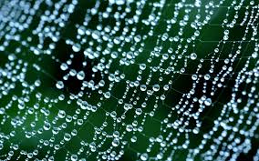
  I like this photo because it shows pattern through something natural. The combination of the spider web and the water droplets create a fascinating way of presenting pattern. The photographer has taken it extremely focused with outlines the pattern presented. The background contrast with the droplets and the spider web is almost invisible which works well because it prevemts distractions away from the pattern.
I would like to use the idea of rain droplets in future projects.


Texture straight images


   I chose this as one of my favourite photographs which I took because it is well focused and I like how close up it is. As shown in my texture image bank, the images were taken as close up shots to clearly show the textures in an object/objects. A close up shot causes us to we at the different textures within this photograph such as the smoothness of the corroded bricks and the roughness of the stoney ground. We would not usually look at the ground and view the different textures within it and look at how and why the contrast  so taking a picture like this, takes everyday objects and looks at tiny details within them which would go ignored. The bricks are different tones and some stand out more than others. Incorportaing colour within subjects such as texture, mean that certain textures stand out more than others. This picture causes us to look at individual bricks one by one, starting with the ones which we see first (like the ones in the front of the pciture).


  This photograph is one of my favouriotes because I like the different depths of the ridges in the wood. I am immeditely drawn to the deepest ridge because this shows the most amount of texture. I like how wood within the topic texture shows rough surfaces and shows clear lines/cracks within it. This helps us to think what the image would look or feel like if we were to have the objection front of us. The photo is extremely focused to the point where we can see some discoloured splashes on the wood. This breaks up the rough texture and make it more interesting.


  I chose this photo as one which showed texture extremely well because the cracked painted surface is extremely focused upon. The deep cracks and peels on the paint are reflected by the beam of light in the top left hand corner which illuminates the texture. The saturated colour red intensifies the cracks and peeled surface. I was interested i photographing a painted surface to show texture because I think you can take a lot from it, especially one such as this because of how deep the cracks and ridges are.


  I think that this photo is on which shows texture well. The texture is shown exactly how people who would imagine that bricks would look and feel in real life. The angle which i have taken this photo at works well with the subject topic because I have taken it from a close enough angle to present vivid texture.


  I like this photograph because the textures are all different. Thee is not one specific texture throughout the image like the ones shown above. I look more closely at each individual slab to recognise the different textures in them. There are some rough surfaces and ridges as well as smooth surfaces shown which is why I think that this shows texture well - the photo explores different textures and incorporates them into one. There are different beige tones shown in this photo which outline the different textures. For example, there are some smoother textures which are light beige in colour and some rougher textures which are a darker beige.

Pattern Work Diary


Planning


Evaluation and Progression 


  I chose this photograph as one which worked well with pattern because the arrangment of the windows represents pattern well. I did not need to adjust my camera settings because the natural daylight was best to work with in this situation. I think that the long shot approach I took when taking this works best when photographing a picture like this one. Sometimes, pattern is not obvious to the eye but if you start looking closely at everyday objects and how they are arranged, you enter the world of pattern. People would not usually look at a block of flats such as these and recognise pattern incorporated. The white painted surface contrast against the brown bricks, which breaks the pattern and makes it more pleasing to the eye. If I were to photograph this again, I would try taking it from further aback to capture the white and brown combination which would also be a pattern, as well as the windows. I would also try and cut out the top of the picture which would mean that the pattern of the white and brown and the arrangmwent of the windows would be solely focused on. I would also try and straighten up my photo - not pointing my camera upwards and instead straight ahead. However, it is sometimes hard to do this without a tripod because it is difficult to keep a steady hand.


   To improve tho photograph, I used Photoshop to crop out any distractions. I also straightened the photo up because it was slanted and looked messy. I adjusted the saturation and vibrance of the photo because it looked quite dull. In my opinion, there was very little changes I could make to this as it was how I had taken it that needed to be changed.


   I chose this photograph because I like the illuision that the continous pattern creates. It becomes confusing to keep up with the irregular pattern which is why I like it. I think that the angle in which I took it matches well with the illusion which it creates - it wouldn't be as interesting if I took it with a tripod or took it as a straight ahead angle. In my opinion, irregular patterns are more interesting than regular patterns and therefore, I like this photograph particularly well.  However, this image could be interpreted as bland because the pattern doesn't make up anything - it literally is just a picture of a pattern. The white tiles within the pattern are dominant and is what the eye catches onto first but then once we look at it further, we catch onto the purple ties also - this is what makes up the illusion. I do not think that I could have taken this picture in any other way which is why I also think that it requires minimal adjustments.


  This photo is of a church and the stained glass windows are arranged in a pattern. I like this because the beam of light which swoops across the windows, almost lights up the windows and presents the 'stained' yellow colour of them. However, I think that this photo would be better if I had adjusted the brightness on the camera, to show the colour of all of the windows. Adjusting the brightness would also prevent loosing the sight of the pattern on the left hand side of the church. If I were to take this photograph again, I would take it at a different angle. I could also adjust the aperture setting on the camera to capture a brighter image, rather than one which is dark. I could also return back to the church and retake the photo on a day which the weather is better, as I feel like the overcast sky effected the brightness of the photograph majorly.

  To improve this photograph, I used Photoshop to firstly adjust the brightness and contrast to bring out the brightness of the picture. I think that this made a major improvement to the image, making it appear more lively and the pattern shows clearer. I did not make any cropping adjustments to this photo because after I had made the previous changes, I felt like the photo did not need to be cropped.  


  I made further adjustments to the saturation and vibrance of the photo which made it stand out even more. The original photo needed a lot of tweaks to ensure it was sufficient in showing pattern. I think with the changes that I have made, it has brought out a better side to the picture. The pattern made by the windows is now obvious rather than before, it was very gloomy and hard to recognise the pattern first handily.


  I chose this photograph as one which presents pattern because the thick black beams create a vivid outline which shows the pattern clearly. I am drawn to the centre of the picture, where the lines all meet up. The lines lead up to the middle of the picture and from there, we make our own way around the picture. Half the side of the picture is lit up due to the sun gleaming onto it and the other half of the picture is dark and gloomy. However, it was hard to control this because I wasn't able to find an angle where the whole picture was of an equal brightness. Despite this, I think that it works pretty well in showing pattern because from the centre, the lines and shapes are equal on each side presented. This pattern is regular. In my opinion, I would not take this photo any differently because as previously explained, it was hard to work with the brightness and I also do not think that the angle of the photo should be changed. Therefore, I didn't feel like this photo needed any adjustments done to it using Photoshop because it already worked well with the subject topic.

  I chose this photo as one which would require some changes because although it does show pattern, I don;t hat that is is fascinating at all. The reflection distracts me form the actual pattern which was supposed to be dominant. I don't think this works well with the subject topic at all. The pattern and the picture as a whole is dull and gives me a sense of unhappiness. Therefore, I would not suggest any improvements to be made for this photograph because I do not think it would work well regardless at what angle I took it or how I edited it.

Texture Work Diary

Planning


Evaluation and Progression

 This photograph worked particularly well because it focuses solely on the textures within the wood. The background is unfocused which makes it easy to ignore the distracctions in the background. I adjusted the brightness on the camera from +1 to +3 because the photo orginally consisted of shadows which masked the intricate details wthin the engrains of wood. This works extremely well with the subject topic of texture because it shows deep ridges in which we can see details - each individual ridge is different. Usually, people would not look at this object and imagine how this could be interesting to look at. However, I think that this picture represents how, with the right angle and camera setting, you can achieve a final outcome which brings more life to an object. If I were to take this photo again, I would take it at a different angle which excluded the objects incorporated in the background - this would mean it would only be the texture and details of the object that would be the main focus instead of the objects in the background also.

  In my opinion, editing this photograph was not an option because I felt that the lines and texture of the wood already stood out extremely well. I thought that the photo may look odd if I had cropped out the objects in the backround - I already thought that this worked well and the background objects did not override the textures of the wood in the foreground. I don't think that editing would make this picture any better, however possibly I could take the image from a different angle to show only the textures of the object.

  I think that this photo worked well as representing texture because it was more effective in showing texture in comparison to other photographs that I had taken of bricks. The photograph clearly shows the rough texture of the bricks because the details are deep which therefore are more outlined. In my opinon, when

 looking at texture, it is important to remember that people need to be able to imagine how the object would feel or look like if they were to touch it or see it in real life. Taking this into mind, I feel like this image works well with showing the texture that people would imagine bricks to have. Howeverr, I think that this photograph looks almost rounded - it makes it hard to look at the textures in the bricks. I also think that the vivid colour of the wall dampens the boldness of the texturesd on the bricks. I also think that the details in each indiviual brick is hard to focus on and the bricjks as a pattern are what we look at more.

  Therefore, I used Photoshop to chnage the photo into black and white. After this, I then used to 'curves' editing option to darken the image. This is because I think that a dark photograph outlines the textures better than if the photo were to be coloured or bright. I like how by editing this photograph, the details which were orginally hard to see are now more visible. By adapting this, it works better with the subject of texture rather than pattern, as it is eaiser to view each indicidual brick tather than all of the bricks as a whole.

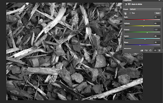
   I chose this photograph as one whihc worked well becasue it is different to the ones which I have shown above. The individual pieces of bark itself do not create the texture (like the indivual ridges and the individual bricks shown above) however all the pieces of bark put together as a whole picture are what creates the texture. Each piece of bark has very little details within it, which is what makes this photograph different to the rest. The layers of bark are instead what creates the texture - you can see where pieces of bark lay on top of each other ad gaps where pieces of bark do not lie. The photograph is conciously taken from an angle which is far away because it would be hard to capture the details in an individual peice of bark and relate this to texture. I felt like this was effective in showing texture because it was obvious and that very little changes needed to be applied.
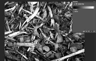
      To edit this photograph, I used Photoshop to changeit into black and white. I then adjusted the gradient map to brighten the whites in the image - I felt as if there was a sign of sullness which was dominant when I orginally chandged it into black and white. I also adjusted the colours within the black and white layer - adjusting each colour in an attempt to make the outlines of each indidvual pieces of bark stand out better. These were the only changes that I made to this photograoh because it wokred well with presenting texture.


  I like this photograh because it shows deep texture of a painted surface. The bright red paint allows the ridges to stand out more and the bright light in the corner makes the textures stand out better. To take this photograph, I adjusted the shutter speed so that the photograph was taken quicker and therefore, I was bale to capture the extremely focused texture on the surface. I think painted surfaces are intriguing to photograph when looking at texture because they represet a different way to photograph an object relating to texture. I also adjusted the brightness on the camera to make it more dull - there was a bright light which was already shining onto the photo and therefore I needed to lower the brightness so that it wasn't too overpowering that the intense textures and details were not as visible. This photograph was so effective, that I decide to leave it untouched and not edit it at all.


   This photograph consists of several different textures - the pavement tiles look smooth but the photo also consists of some rough patches. I chose this pciture as one which worked well because I liked how it showed different textures.
Each individual tile is different and is similar to the other pictures that I have takem - where the indidvual objects containing the different textures are what we focus on, rather than the picture as a whole. In comparison, if the tiles were all the same, this picture would work better whixch the subject pattern than it would texture. Again, I felt as if this photo required little adjustments.

Progression


  I chose this photo as one of the ones which would need improving. I chose this one because I did not take it at the correct angle for this subject topic. It does not really show texture at all because I haven't taken it close enough to show it. In my opinion, this photo works better with the subject topic of pattern.