
Monday, 3 October 2016
Form Definitions
Form - the visible shape or configuration of something. It is a three dimensional shape such as a cube, sphere or cone. In photography we used tone an perspective to create an illusion of form.
 This is an example of form photography - you can clearly see the shape of the difference shapes within the object. It shows density and lines within the object.

Thursday, 29 September 2016
Texture image bank


I chose this image as one which inspired me because I like how the different shells and pebbels are different sizes and therefore are contrasted in textures. Some of the shells contain ridges however some are smooth, as of the pebbles. It creates a bumpy look and some look more sunken than others. In my opinon, incorportaing colour into topics such as texture, is important because it can be used in a way to make different textures stand out. The lay out of the pebbles and shells is random and therefore creates a mix up of textures. Not only does the individual objects contain different textures themselves, but as a whole, they create a sharp look and texture.
Wednesday, 28 September 2016
Colour image bank
 This image consists of flowers - some which are in black and one and one specific one which is in colour. This is an intriguing use of colour because the flower consists of analogous colours (red and orange). It also uses a colour splash technique which is the main focus of the picture. The background in blurred and the flower, which is in the foreground is in focus. In my opinion, this photo is extremely interesting because it consists of three participants which make a good photograph - the colour splash, the unfocused background and the analogous colours. The use of colour splash links well with the topic of colour which I am currently looking at because it instead of the whole photograph being coloured, only one flower is coloured which makes people look at the colours in the individual flower, rather than all of the flowers as a whole. It also works better than just one single coloured flower being in the photograph alone because I feel as if the colours would not be focused on as much as they would be within this photo. The photographer has consciously taken and edited this image in this particular way to present how colour can be shown in more of an effective way than just taking a photo of something colourful.
I chose this photo as one which inspired me. The photo consists of the colours red and green which are complimentary colours: green which implies refreshment, nature and possibly blandness and red which represents anger, strength and warmth. Due to the fact that the colour red is such a strong colour and green could be implied as bland, I think this is why the colour red in this picture is the dominant one - it stands out a lot more than the green grass and is the first colour which our eyes are drawn to. The red in this photograph is so strong against the green, that it is easy to ignore the fact tat this photo also consists of some yellow in the background. The colour red seems more saturated and vivid than the green. However the red could be edited to be even more saturated, contrasting the two colours further, I could use this idea of contrasting red and green against each other in future photographs which I will take.

This photo consists of muted, dull colours. It is not the photo itself which is uninteresting, but the colours which it consists of which make it gloomy. I think that the scenery works well with the colours because it is fairly bare and creates a 'depressing' mood. The trees are no longer alive and lack emotion, which a green and alive tree would have. Furthermore, I think that the photographer has consciously paired the bare scenery and the muted colours together to further outline the effect that this can create. The colour grey could imply lifelessness and although the colour green which could represent refresh-fullness is incorporated into the scenery, it is not saturated which does not give me the refreshed feeling which it implies. Within the subject of colour, I will possibly use this idea of inking nature and muted colours together because it really shows a different side to colour.
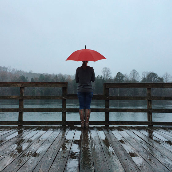
I also chose this as one of my favourites because it shows both muted and saturated colours. Clearly, the colour which we are originally drawn to is the red on the umbrella. The dull colours we do not really focus on because there isn't really anything major happening involving colours. This is good because they contrast against each other which prevents it from being too uninteresting to look at. The long range shot that this photographer has used, shows the contrasting colours better than a close up shot would. This type of shot allows room for people to take in the dull background and to compare it with the red umbrella. The individual standing with the umbrella, is even wearing clothes consisting of muted colours which is more effective than if they were to wear bright vibrant coloured clothes.
Monday, 26 September 2016
Pattern Definitions
Pattern is an underlying structure that organizes surfaces or structures in a consistent, regular manner.
Pattern can be described as a repeating unit of shape or form, but it can also be thought of as the "skeleton" that organizes the parts of a composition.

Patterns
are simply repeated shapes, colours or objects, ordered in either regular or
irregular formations. As a photographer, using pattern is key to good
composition and, when used effectively, can transform an otherwise bland image
into something dramatic and eye catching. Patterns are formulated all around us
- in both natural and man made settings.
Texture Defintions
Texture refers
to the tactile qualities of the physical surface of the object.
Texture can be accentuated by the side light of early sunny mornings or early evenings, or by overhead light when the sun is vertical and high in the sky.

 The photographer has shown texture through the still life image of food. The food is spiky on the outside.
Irregular Patterns
Texture can be accentuated by the side light of early sunny mornings or early evenings, or by overhead light when the sun is vertical and high in the sky.

 The photographer has shown texture through the still life image of food. The food is spiky on the outside.
Regular Patterns
Some
of the most rewarding patterns to shoot consist of shapes, lines or colours that
repeat in a strict formation. Filling a frame with clear-cut lines or a
consistent geometric formation.Irregular Patterns
There
is often the presumption that a pattern has to involve straight lines to
produce something recognisable as a
pattern, but this is not the case.
In the
natural world, patterns can be found in irregular formations and, in direct
contrast to regular formations
Friday, 23 September 2016
Colour straight images

I chose this photo as one of my best because I like the way it shows muted colours such as the dull grey and off - red colour. I also like the angle of the photograph and instead of taking a close up shot of the colours I took it from a long distance away and pointed the camera upwards. The muted colours may have presented a boring side to the photo and therefore, I think that taking the photo from this angle prevented it from being too boring. If I were to retake this photo, I would take it at a different angle to prevent the background from being too over powering and cancelling out the muted colours.

This photo is one of my favourites because I like how the colours are intense and very saturated. I also like how the balls are unintentionally set out in a way which compliments each other - there are none of the same colour which are next to each other. I also like how there is no background colour which interferes with the intense colours. The objects are of a wide variety of colours and is a more intriguing way of showing saturated colours rather than just photographing a painted surface.
I chose this picture as one of my favourites because the blue and yellow contrast well with the muted colours in the background. This picture fits well into the topic of colour because it consists of both saturated and muted colours. The blue lid and the yellow liquid contrasts well with the dull background. I also like how it is positioned - I think this is more interesting than just photographing a picture of a bottle standing against a dull background. A close up shot mess that I could capture the bright colours against the background completely, without anything interfering.

This picture consists of analogous colours: red and green. The individual colours work well together and both stand out. I like how the background is bright which makes the whole picture brighter in general. The colour red links to warmth and the colour green links to nature which I think this photo links to well.
Colour Work Diary
Planning

Evaluation and Progression
My focus for this topic was colour and all different types of colour. I also looked at muted, saturated, analogous and complementary colours. When looking for objects to take images of, I took all of this into account and took a variety of images to show I understood different types of colours. I looked for objects which I could take pictures of that would present colour in a more interesting light.

The colours in this photo such as red and green, are complimentary colours. They work well together and each colour stands out in contrast to the opposite colour. I like this image because the focus is good which is ideal for a good photograph showing colours, especially ones which contrast each other. The colours are saturated and vivid - they are bright and intense. I like how the background is bright also because this means that there is not too much else to focus on. It also ensures that people do not get distracted by any other colours other than red and green, when looking at the photo. If I were to take this picture again, I may take it at a different angle, to capture more of the colour red within the photo. This is because I feel as if although this picture works well with the topic of colour, that there could be more of the colour red. I think that this would make the picture better because there would be even more contrasted colours within it. I also could take it at a different angle to ensure that there is no background showing. The background works well with the colours however, it could make the picture better if there was no background in view.

 This photograph shows muted colour such as the grey and off red colours. I think that the muted colours on the building contrast well with the blue sky in the background. However, to improve this image I could make the muted colours deeper because I think the bright background over rides the muted colours shown on the building which makes it hard to focus on the other colours. I also think that if I were to take this again, I would take it at a different angle - trying to cut out most of the background and any other objects that are seen in the image. This is because the muted colours which I aimed to show, are not dominant and instead the background is. I like the fact that there are different tones of the muted colours. For example, there are some light grey tones and some dark grey tones. This adds more to the picture because it means that there isn't just two block colours. This picture is almost depressing due to the lack of saturated and intense colours - it creates a sense of darkness and unhappiness.
Progression


Evaluation and Progression
My focus for this topic was colour and all different types of colour. I also looked at muted, saturated, analogous and complementary colours. When looking for objects to take images of, I took all of this into account and took a variety of images to show I understood different types of colours. I looked for objects which I could take pictures of that would present colour in a more interesting light.

The colours in this photo such as red and green, are complimentary colours. They work well together and each colour stands out in contrast to the opposite colour. I like this image because the focus is good which is ideal for a good photograph showing colours, especially ones which contrast each other. The colours are saturated and vivid - they are bright and intense. I like how the background is bright also because this means that there is not too much else to focus on. It also ensures that people do not get distracted by any other colours other than red and green, when looking at the photo. If I were to take this picture again, I may take it at a different angle, to capture more of the colour red within the photo. This is because I feel as if although this picture works well with the topic of colour, that there could be more of the colour red. I think that this would make the picture better because there would be even more contrasted colours within it. I also could take it at a different angle to ensure that there is no background showing. The background works well with the colours however, it could make the picture better if there was no background in view.

To improve this image, I used Photoshop to adjust the contrast, saturation and brightness to make the colours stand out against each other even more. They are now extremely saturated and intense which makes the colours even easier to focus on. The dominant colour is red and by improving the picture on Photoshop, it has made the colour red especially brighter. I only make subtle adjustments to this photo because I felt like it worked very well already. I cropped out some of the photo because with the adjustments that I had made, some of the berries had become barely visible and I thought that this spoiled the intensity of colour of the the berries. 

Evaluation
 This photograph shows muted colour such as the grey and off red colours. I think that the muted colours on the building contrast well with the blue sky in the background. However, to improve this image I could make the muted colours deeper because I think the bright background over rides the muted colours shown on the building which makes it hard to focus on the other colours. I also think that if I were to take this again, I would take it at a different angle - trying to cut out most of the background and any other objects that are seen in the image. This is because the muted colours which I aimed to show, are not dominant and instead the background is. I like the fact that there are different tones of the muted colours. For example, there are some light grey tones and some dark grey tones. This adds more to the picture because it means that there isn't just two block colours. This picture is almost depressing due to the lack of saturated and intense colours - it creates a sense of darkness and unhappiness.
 Progression


I only wanted to make small changes to this photograph because I felt like nothing major should be done to make it better but would take in account how I would retake the picture if I had the chance. I adjusted the Exposure, offset and gamma correction. There isn;t much difference to the photograph but I think that the background looks less dominant than before and you focus more on the muted colours on the building. This picture doesn't work as well as other pictures because I should have taken it at a better angle but I do think that it is still effective.

Evaluation
 I like this photo because there is no background space and it is filled with colour. All of the colours are very intense and saturated. There is a wide variety of colours in the photograph which is why it's one of my favourites. I also like how the balls have unintentionally been placed in an order which works well - there are none of the same colour next to each other. The colours are bright which make it exciting and each individual ball stands out - there is no specific ball which is brighter than the other. The variety of colours within the picture create a happy effect.
This photograph needed barely any adjustments done to it. However, I used Photoshop to make it even more saturated and vibrant. Each individual ball stands out even more and the colours are stronger/deeper. This gives me a strong sense of happiness and personally, I wouldn't do anything else differently to take this photograph. There is no interference with the colours which I had in some of my previous photographs which is why this fits so well with the subject topic of colour.
 Progression

Evaluation
 I like this photo because there is no background space and it is filled with colour. All of the colours are very intense and saturated. There is a wide variety of colours in the photograph which is why it's one of my favourites. I also like how the balls have unintentionally been placed in an order which works well - there are none of the same colour next to each other. The colours are bright which make it exciting and each individual ball stands out - there is no specific ball which is brighter than the other. The variety of colours within the picture create a happy effect.
This photograph needed barely any adjustments done to it. However, I used Photoshop to make it even more saturated and vibrant. Each individual ball stands out even more and the colours are stronger/deeper. This gives me a strong sense of happiness and personally, I wouldn't do anything else differently to take this photograph. There is no interference with the colours which I had in some of my previous photographs which is why this fits so well with the subject topic of colour.

In my opinion, this is one of my worst photos that I took to represent line. This is because I don't like the angle that it was taken at. The image wouldn't be so bad if I had taken it as a long distance shot - I don't think it works well with the subject of colour. However, I do like the red against the black background because I think that these colours contrast majorly so therefore, I think that this image would be effective in showing colour if I had taken it from a different angle. To improve on how I take my photographs to ensure that they work well with the topic, I should take several shots of the same object but from different angles and distances. this would also make my pictures more interesting rather than just looking at a picture that was taken from head - on. I could have also used a tripod to take this photo to prevent it from being on a slant. This would ensure accuracy of the lining in the photo.
Subscribe to:
Posts (Atom)