Thursday, 4 May 2017


Sunday, 23 April 2017
Physical Images Work Diary
Evaluation and Progression
Evaluation
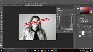
 Here is an example of one of the physical images I created. I gathered inspiration from the famous photographer Barbara Kruger and Pinterest. Here I took a portrait image of a female smiling. I edited it within Photoshop to put a black and white filter on it and also adjust the brightness and contrast settings. The reason for this was because the red highlighted phrase which I was going to stick across the image, contrasted better when the image was in black and white - it also related better to Kruger's work. Here I pasted the words 'we are not what we seem' across her face. I covered all of her facial features other than her mouth because I wanted her smiling expression to be visible. I chose to write these words because I wanted to outline the fact that no one truly knows what other individuals have happening behind closed doors or they do not know if how they seem is really how they are. I thought that these words worked well with the smiling expression she has because it makes us question if she really is as happy as she looks. I created this image by hand and then scanned it to get it onto the computer and into my blogger.
Progression

Here is my final and edited image of the one previously shown. I used Photoshop to make some minor adjustments because I liked how the image worked already. Firstly, I cropped some of the wide edges around the main image out because this was negative space. This was due to the scanning of the image. I then adjusted the contrast and brightness of the image to try and introduce some darker tones. This was because the image consisted of many light tones and very little dark tones. Lastly, I used the 'curves' setting to again try to introduce more dark tones into the image. I am very pleased with the final outcome because there is more of a balance between the opposite tones. I think that this image successfully relates to the work of relevant photographers and is a good example of physical image making. I don't think that I would do anything particularly different if I were to remake this image.
Evaluation
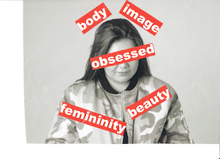 Shown here is another example of a physical image which I created. I again, used my photographer research and ideas from Pinterest to influence how I created this image and the words which I used. I took a picture of a female who holds and emotionless expression on her face. I chose to put the word 'obsessed' in the middle of the image, covering her face and the opposing words surrounding it. I consciously arranged the words this way because the surrounding words are the aspects which many women are 'obsessed' with. I wanted the picture to look cramped because it relates to how women may feel due to the many pressures they receive to be and look a certain way by the media and wider society - a women may feel trapped. Difference is disregarded of in society and therefore many women feel obliged to fit the idea of being 'perfect' which includes have a certain body type, looking and being feminine at all times and looking presentable when in company.


Here is a my final edited image of the one presented above. Again, I only made some minor adjustments because I already like the way that the image worked. I made similar adjustments to the previous image because they both required the same changes. I used Photoshop to firstly crop the image because similarly, there was negative space from where I had previously scanned the image. This meant that the image is now more centred and the focus point is more vivid. I then made the image darker and the tones more contrasted because again, the original unedited image consisted of a large amount of light tones and little dark tones. I lastly used the 'curves' setting within Photoshop to darken the dark tones within the image so that there was more of a balance between the two. I am very happy with the final outcome because I think that it relates well with the work of Barbara Kruger. I don't think that I would do anything particularly different if I were to remake this image because I think that it is a successful piece of work.
Progression
To progress my work further, I should complete more physical images which differ to these two. I could possibly photograph a different individual or a different scene, which would add some variation to my physical image work.
Evaluation

Progression


Here is my final and edited image of the one previously shown. I used Photoshop to make some minor adjustments because I liked how the image worked already. Firstly, I cropped some of the wide edges around the main image out because this was negative space. This was due to the scanning of the image. I then adjusted the contrast and brightness of the image to try and introduce some darker tones. This was because the image consisted of many light tones and very little dark tones. Lastly, I used the 'curves' setting to again try to introduce more dark tones into the image. I am very pleased with the final outcome because there is more of a balance between the opposite tones. I think that this image successfully relates to the work of relevant photographers and is a good example of physical image making. I don't think that I would do anything particularly different if I were to remake this image.
Evaluation
 Shown here is another example of a physical image which I created. I again, used my photographer research and ideas from Pinterest to influence how I created this image and the words which I used. I took a picture of a female who holds and emotionless expression on her face. I chose to put the word 'obsessed' in the middle of the image, covering her face and the opposing words surrounding it. I consciously arranged the words this way because the surrounding words are the aspects which many women are 'obsessed' with. I wanted the picture to look cramped because it relates to how women may feel due to the many pressures they receive to be and look a certain way by the media and wider society - a women may feel trapped. Difference is disregarded of in society and therefore many women feel obliged to fit the idea of being 'perfect' which includes have a certain body type, looking and being feminine at all times and looking presentable when in company.
Progression


Here is a my final edited image of the one presented above. Again, I only made some minor adjustments because I already like the way that the image worked. I made similar adjustments to the previous image because they both required the same changes. I used Photoshop to firstly crop the image because similarly, there was negative space from where I had previously scanned the image. This meant that the image is now more centred and the focus point is more vivid. I then made the image darker and the tones more contrasted because again, the original unedited image consisted of a large amount of light tones and little dark tones. I lastly used the 'curves' setting within Photoshop to darken the dark tones within the image so that there was more of a balance between the two. I am very happy with the final outcome because I think that it relates well with the work of Barbara Kruger. I don't think that I would do anything particularly different if I were to remake this image because I think that it is a successful piece of work.
Progression
To progress my work further, I should complete more physical images which differ to these two. I could possibly photograph a different individual or a different scene, which would add some variation to my physical image work.
Monday, 27 March 2017

Sunday, 19 February 2017
Final Evaluation
Evaluation
I think that I have produced some pieces of work that were to a good standard. I really enjoyed shooting the documentary project because I travelled to London which is an area that holds a large amount of potential for a photographer. I also enjoyed this project because it allowed me to compare what life is like within urban and rural areas and look for differences between the two. I was able to express these differences within my photography. Another topic in the series which I really enjoyed looking at was 'shape' because I felt that there was so many pathways you could follow when taking your pictures. Shape was a very diverse project because I was able to be flexible and photograph practically anything which I wanted to. I think that I gathered some really well taken photographs within this project which are unique and intriguing and therefore, I think that this was a successful shoot.
To gather the images for my final portfolio, I tried to select at least three images from each project I had explored. This would create a variety of differed images and therefore, would make my portfolio more interesting to look at. I feel that if there is a wide range in someone's photography, people feel more drawn to your work which is what I have tried to do with my portfolio.
Personally, I do think that I have created a cohesive body of work because I have tried to merge different focuses together to create links within my work. For example, integrating form photography into tone photography. I think that I have explored each project well and therefore it is easy to make links between focuses.
The research that I have gathered on some popular photographers, has really influenced the way in which I took my photographs, including angles, styles and how I edited them. For example, when looking at the work of Barbara Kruger, it was particularly influential for me because the style of work she used to share her opinions on society and everyday life, was inspiring for me. Furthermore, I tried to create my work in a similar style, using quotes/ phrases which expressed my thoughts, feelings and opinions on specific subjects.
During this project, I have gathered more knowledge about how to take photographs to a better standard. For example, I have learned how to adjust the camera settings, depending on which style of photographs I am taking (changing the shutter speed, ISO, aperture). I have presented my use of different camera settings within the 'movement' project. Learning different camera settings was particularly helpful because it means I can show a range of camera skills within my work. I have also learned how to adjust studio lighting and the arrangement of the equipment. For example, within my 'tone' project, I explored with harsh and soft lighting and looked at the different effects that different lighting can have on an image. By learning the arrangement of the equipment in the studio was very helpful because I could set up and adjust it without struggling for help. Learning skills when shooting has been extremely helpful. For example, learning what angles to use in which situations, taking advantage of the available light, when to use a tripod and so on. Learning these basic techniques when shooting images, was influential on my work because it meant that I gradually developed, using the different skills when taking images. There is a visibly clear improvement and development within my work and I feel like in learning the simple skills when shooting, has been helpful in showing this. I also found that learning different ways adjust the composition such as using the rule of thirds (foreground, middle ground and background) means that your images are not as general and you can show variety within you work. Overall, I have gained more knowledge surrounding photographing good images by taking on board all of the things I have learnt and this has lead to there being a really clear improvement during this project.
In my opinion, the way that I take photos has changed for the better. I gradually started to show more of a range within my work such as range in angles, styles, tones, editing. Really thinking about how I take photographs has helped because it shows within my work - I think that you can really see that I take time when thinking about how I take my photos.
I not only have tried to show developments and adjustments within actually taking the images, but I have tried to show experimenting within editing using Photoshop. Having knowledge about how to use Photoshop was extremely important so gaining knowledge about how to use the variety of different tools within the editing app meant that I could show that I was stretching myself to explore. I demonstrated my ability to experiment by focusing on composite image making and physical images making, two topics which I particularly enjoyed. The Composite Image Making topic really made me think about which backgrounds and objects to use that showed a abstract presentation within the photos. I also had to use new tools within Photoshop which therefore demonstrates experimentation. The topic Physical Image Making (inspired by Barbara Kruger) I feel showed a different side to photography. It involved printing and scanning the images I had physically created by cutting, sticking etc. This therefore, was different to opposing topics within the project which again, shows variety and experimenting within my work. I think that I completed both topics well and therefore, they show my abilities to experiment well.
I think that certain topics were more successful than some of the opposing topics. For example, I think that the Documentary project which I completed over the Christmas break, went fairly well because I linked two topics together, which were in fact completely different (rural vs urban). I also travelled to London to try and gather some really good images which added variety to my work. I think that the Movement topic was not as successful due to the fact that I was at the time, getting used to the new camera settings which I learnt etc. I also think that some of the areas which I looked at, at the start of the project such as 'Line' or 'Texture' did not show my full potential. Despite this, I do think that it is good for there to be a visible improvement within my work. Overall, I am happy with the way that I have explored the different topics within this project, despite some needing some improvements made to them.
Saturday, 18 February 2017


Documentary Shoot Two Straight Images

I took this image as one to represent rural life. This is a picture of a pond near to where I live. It would be highly uncommon to see a small pond such as this one in an urban area such as London. This is because other areas are extremely built up and most natural life is destroyed. This pond supplies me with feelings of peacefulness and it is very quiet around this area which would be highly unlikely to see when visiting a urban area. Even in the evenings when it is less busy, many cars are still on the road so is continually noisy.
Documentary Shoot Two Work Diary
Planning

 Here I took an idea from my mind map of taking photographs of forests as showing rural life. When living in a rural area, there are forests located in close proximity and therefore, it is not uncommon to see here. In an urban area, such as London which I had previously photographed, most of the rural life has been destroyed due to demand of housing and buildings. Furthermore, there would not be particularly many forests such as this one when walking the streets of somewhere such as London. I like this image because the trees create a natural walkway for visitors to walk down and I like the fact that it creates a calming effect due to the muted colours and overcast sky.
 To progress my work, I used Photoshop to make only subtle adjustments because I think that the original picture worked well. I made adjustments to the saturation, contrast, curves and exposure settings here. The colours have been intensified and the picture generally looks brighter and better. If I were to take this picture again, I would maybe use a tripod and try to capture more of the tree length in to add depth to the image.
Evaluation

 Here is my final edited image of the one previously shown. I used Photoshop to make some only small, subtle adjustments to this picture because I really liked it how it was. I adjusted the contrast and vibrancy of the colours which made them more vivid. I also adjusted the brightness and exposure of the image to make the people in the distance more visible. I like the final image better than the original one, despite only small adjustments being made. I like how the colours such as the green grass and the dashes of yellows from the planted flowers are now more saturated and vivid. This really highlights the beauty of an urban area such as this one. I don't think that I would do anything particularly different if I were to reshoot this image because I really like the final outcome. I feel like I really took my time when thinking about many things which build a good photograph such as composition, angle lighting and camera settings when taking this image.


Evaluation and Progression
Evaluation
 Here I took an idea from my mind map of taking photographs of forests as showing rural life. When living in a rural area, there are forests located in close proximity and therefore, it is not uncommon to see here. In an urban area, such as London which I had previously photographed, most of the rural life has been destroyed due to demand of housing and buildings. Furthermore, there would not be particularly many forests such as this one when walking the streets of somewhere such as London. I like this image because the trees create a natural walkway for visitors to walk down and I like the fact that it creates a calming effect due to the muted colours and overcast sky.
Progression
 To progress my work, I used Photoshop to make only subtle adjustments because I think that the original picture worked well. I made adjustments to the saturation, contrast, curves and exposure settings here. The colours have been intensified and the picture generally looks brighter and better. If I were to take this picture again, I would maybe use a tripod and try to capture more of the tree length in to add depth to the image.
 Evaluation
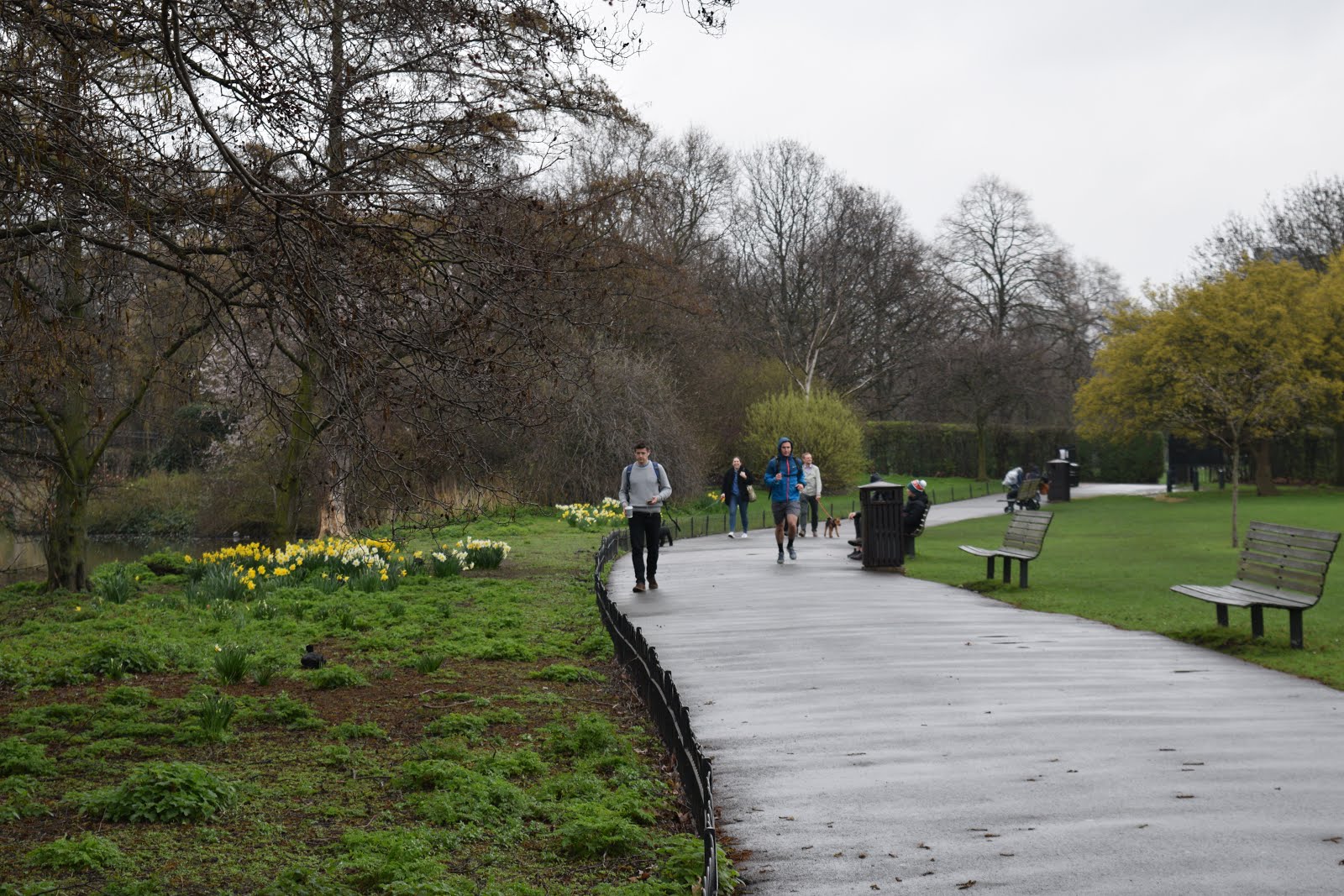
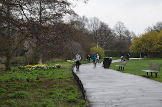
Here is an image that I took in a local park / pond area near to where I live. I really like this image because I have also captured people walking here. This adds some variation to my work within this project - instead of just capturing snapshots of empty rural areas, I have captured some action and movement in the scene. This particular area in somewhere where many individual come to relax, walk their dogs etc due to is being very calming and quiet. I like how it is not centred and path is offset. . It would be unusual to find somewhere such as this in a urban area such as a busy city such as London. Most of the space is built up with roads, houses, buildings, tourist attractions etc and there is not as much greenery or life within these areas.
Progression

 Here is my final edited image of the one previously shown. I used Photoshop to make some only small, subtle adjustments to this picture because I really liked it how it was. I adjusted the contrast and vibrancy of the colours which made them more vivid. I also adjusted the brightness and exposure of the image to make the people in the distance more visible. I like the final image better than the original one, despite only small adjustments being made. I like how the colours such as the green grass and the dashes of yellows from the planted flowers are now more saturated and vivid. This really highlights the beauty of an urban area such as this one. I don't think that I would do anything particularly different if I were to reshoot this image because I really like the final outcome. I feel like I really took my time when thinking about many things which build a good photograph such as composition, angle lighting and camera settings when taking this image.
Evaluation

Here is an image I took of a small pond near to where I live. People come here regularly to feed the ducks and just relax in an environment away from drama etc. Small pond areas such as this one are not uncommon to see in rural areas like where I live. In the background, some houses are visible. If you were to travel to an urban area such as London, it would be rare to come across a small pond area like this one within a housing estate. I like the reflection of the surrounding trees on the pond. There is not much of a variety of colours in this image. I should edit this image in Photoshop to improve how visually pleasing it is.
Progression


Here is my final edited picture to the one previously shown. I only made some very minor adjustments here because I liked how the original picture worked. I made the image brighter using the 'brightness' setting on Photoshop because I felt as if the previous image was very dull and dark, possibly due to the overcast sky on this particular day. However, I only adjusted this slightly because I felt like that this was all that was needed. I contrasted the tones more using the 'contrast' option on the editing program. I also adjusted the vibrancy of the colours to make the green in the image stand out better because I felt as if they were very muted. It is clear that I have only made some small changes to the previous image but I think that they have been very effective in the presentation of the image. If I were to take this picture again, I would maybe take it at a different angle to try to let more natural light into the image - this would prevent it from being as dark.
Progression

I chose this image as one which I would need to improve. I did not choose this particular image because I think that it is bad however I think that it may work better in another area of photography such as line photography, rather than landscape. This is because I have not really captured the type of landscape image here which I was aiming for. I think that the images previously shown are a better take on landscape photography.
Monday, 30 January 2017
Composite Image Making Straight Images

I made this image by combining two images together using Photoshop. I took some pictures of cards in the studio and placed it on a background of London. I think that the idea of playing cards and London as a destination work well together because cards may firstly be classed as more of a British game. I like how the cards look life sized and one even looks bigger than the surrounding people. I used Photoshop to crop an edge of the card so it looks like it was sticking out of the ground. I like this image because the cards look solid and large in size (even though we are aware the they are actually flimsy and smaller than our hand in real life). I could possibly try converting this into black and white in Photoshop.
Connecting Essay 4
Faye Godwin

I chose this piece of work produced by Godwin because it is similar to my focus when looking at landscape photography. She loved to photograph pictures of natural land areas such as fields, forests and so on. I took a similar focus when looking at landscapes because I enjoy finding new areas which I can photograph. It opens up many windows rather than just photographing similar things such as buildings (they all look similar and therefore it would get boring). I like how she has found a spot whereby the pathway which is created by the separation of the trees is broke up by a fallen tree which curls round. She has shown how nature is unpredictable. Furthermore, by photographing static objects such as buildings, the shape/ presentation of them never changes where as, a photographer could walk through a forest and find several spots to take images which would all differ from each other.

The image pictured to the right is one which I took when searching for interesting places to photograph which involved the presentation of natural land. I used Photoshop to switch the image into black and white to further represent similarities between mine and Godwin's work. This image is similar to the one shown above because I have captured a similar walk way whereby the trees lead into a pathway. I took a similar approach to that of the photographer by taking landscapes of groups of trees rather than individual ones. I also did not photograph the whole tree, mainly just the bodies of them as did Faye Godwin. I like this image because it has a mysterious feel to it because our eyes are lead towards the end of the 'pathway' created by the positioned trees which makes us want to devour deeper into the forest.
Connecting Essay 3
Imogen Cunningham

I chose this image taken by Cunningham because she has taken a photograph of flower, which is an object popularly photographed due to it's representation of life and growth and she has added strong contrasting tones to highlight the form of flowers. I think that flowers are an interesting object to photograph within form photography because there are so many varieties and therefore they all hold different forms. For example, here each of the three flowers holds a different form because this is the way that they have naturally grown. Imogen has consciously presented the flowers in the light of such contrasting tones (bright whites and dark greys etc) to hide areas which were not important. I think that she is trying to encourage viewers to look at the smooth and unique form that the flowers hold rather than the details such as the colour of them or the details on the petals because we rarely acknowledge the natural shape each flower has and instead, we look at if it 'looks pretty'. The flowers all smooth and spiral shaped. I think that the close compact of the flowers create an all round more interesting effect than if we were looking at just a single flower. The dark background makes the white flowers stand out more.
 I chose this image from my selection of form/shape images to present the similarities between our work. Although the flowers in my image are a small amount brighter, it is easy to see the similarity between the extreme contrasted tones in each image. I also like this image of mine because the other flowers in the background are blurred, similar to Cunningham's work where the flowers further towards the back are less visible. You therefore focus on one or two individual flowers rather than a whole bunch (which we may be used to seeing more rather than singular flowers). Again, the dark background makes the flowers in the foreground stand out better due to the extreme contrast.
Sunday, 29 January 2017
Composite Image Making Work Diary
Planning
 Evaluation


Here I took two images: one a playing card which was photographed against a plain background in the studio and another which is a landscape which I took in London which we can see the London Eye presented in. I wanted to put these images together because I think it would create an interesting look. Using playing cards to play games at family parties for example, Christmas could be perceived as a British activity. This is why I liked the idea of merging these two specific images together because London is a popular place which is well known. I thought that the image of the London eye which I had taken held a good amount of space to place the picture of the playing cards in there. I liked the fact that there were people in the landscape because it makes the picture more abstract.
Progression

To create this image I used Photoshop to combine the two images together. First, I had to rotate the images of the cards and crop an edge off because I wanted it to seem as if the cards were stuck into the floor. I then copied and pasted the images of the cards onto the background of London. I made the cards fairly large because I wanted it to look as if they were as big/ bigger than the people standing in the landscape. I like this image because the cards look solid and stuck into the ground which I feel, makes people look twice to question if they are supposed to be there. Also, I like this image because it almost reminds me of a fantasy lifestyle.
Evaluation

Pictured here is two images which I took to complete the following image: one of a bouncy ball which is alumnus yellow with black spots and another of a grain station. I thought that these two images would work well together because the image of the train station is dark and consists of muted colours where as the bouncy ball is a saturated yellow colour. Furthermore, I thought that these would contrast and create a good composite image. The train station is quite empty in this case and therefore I thought that it would be a good opportunity to work with this image.

Progression

 Evaluation

Here I took two images: one a playing card which was photographed against a plain background in the studio and another which is a landscape which I took in London which we can see the London Eye presented in. I wanted to put these images together because I think it would create an interesting look. Using playing cards to play games at family parties for example, Christmas could be perceived as a British activity. This is why I liked the idea of merging these two specific images together because London is a popular place which is well known. I thought that the image of the London eye which I had taken held a good amount of space to place the picture of the playing cards in there. I liked the fact that there were people in the landscape because it makes the picture more abstract.
Progression

To create this image I used Photoshop to combine the two images together. First, I had to rotate the images of the cards and crop an edge off because I wanted it to seem as if the cards were stuck into the floor. I then copied and pasted the images of the cards onto the background of London. I made the cards fairly large because I wanted it to look as if they were as big/ bigger than the people standing in the landscape. I like this image because the cards look solid and stuck into the ground which I feel, makes people look twice to question if they are supposed to be there. Also, I like this image because it almost reminds me of a fantasy lifestyle.
Evaluation

Pictured here is two images which I took to complete the following image: one of a bouncy ball which is alumnus yellow with black spots and another of a grain station. I thought that these two images would work well together because the image of the train station is dark and consists of muted colours where as the bouncy ball is a saturated yellow colour. Furthermore, I thought that these would contrast and create a good composite image. The train station is quite empty in this case and therefore I thought that it would be a good opportunity to work with this image.

Progression

Here I used Photoshop to create this composite image. I used the quick selection tool on Photoshop to cut out the object which I wanted to place onto the background. I then copied and pasted it onto the image of the train station. I arranged several copies on the bouncy ball in a way that looks like they are falling and bouncing around the image. I really like the final image because the two corresponding images contrast against each other. To progress this image further, I could try out different backgrounds and create some variations of this image.
Progression
I think that I could progress this image by exploring different objects rather than the ones previously used - possibly more unique and abstract objects and place them on more unusual backgrounds to really create a set of images which show my full potential within this project.
Progression
I think that I could progress this image by exploring different objects rather than the ones previously used - possibly more unique and abstract objects and place them on more unusual backgrounds to really create a set of images which show my full potential within this project.
Subscribe to:
Comments (Atom)