Monday, 12 December 2016

Documentary Research Post (Henri Cartier Bresson)

  Henri Cariter Bresson was a French documentary photographer. He first discovered his passion for photography when he saw a image taken by Martin Munkacsi in the arts magazine Arts et Metiers Graphiques. He then started to look further into photography and travels across Europe with his two friends, continuing to take photographs. Bresson suggested the idea about 'the decisive moment'.

The decisive moment refers to capturing an event that is ephemeral and spontaneous, where the image represents the essence of the event itself. 


  This image presents the decisive moment in action. Henri Cariter Bresson took this image right as the birds flew away from the steps. He took the image at the precise moment and if he were to take it any later or earlier, the birds may have already flown away or not even flown yet. He has also captured the moment before the women probably moved (due to the birds near her flying away).


                                                                                     This image was taken in Greece, Cyclades, Island of Sifhnos in 1961. Henri Cartier Bresson had taken this photograph while the girl was running up the stairs. Her body shape tells us that she is in the middle of running. The style of the buildings present the style of old Greece. The building are not modern or up to date (as we can tell by the arrangement of the staircase and how the door frames are not particularly straight). This image is a good representative of the decisive moment and how the photographer had to think carefully about the precise moment to take the picture. If he had taken the image a few seconds later, the girl would not be visible. This would make the image less about documentary photography and less intriguing to look at. I like this image because although we can only see a singular person in the image, there could have possibly been several others running up the stairs also. Therefore, the photographer had taken timing very seriously. In conclusion, timing is very important when documenting an event. I also like how there is a clear distinction between the light and dark tones. The child is far away and is a area of shade is casted over them which makes the outline of the body and the action they are showing more vivid.


Documentary Image Bank


Documentary Definitions

Portrait Research Post (Thomas Ruff)

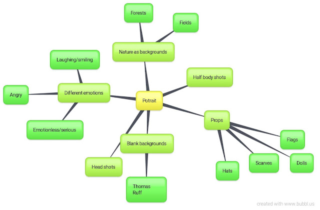
  Thomas Ruff is a German Photographer and one of his main focuses was Portraiture. Ruff embarked on a period of research which looked at the history of portraiture and carried out his own experiments with framing and composition. He decided on a style of portraiture which was as neutral as possible  in an aim to emphasis the person's face - the individuals wore their ordinary clothes and stood against a plain background. Thomas Ruff wanted his candidates to be as emotionless as possible. He outlined that some portrait photographers aim to convey a deeper meaning within a portrait however, Ruff was convinced that a photo is only able to express the superficial, literally showing us the surface of its subject. Ruff first produced this type of work on large scale in 1986.


  This is a good example of a photograph from Thomas Ruff because it is effective in presenting the key components which made up a piece of his work. The women is staring blankly into the camera and conveys no emotion. This is exactly what Thomas Ruff was aiming to achieve. Due to there being no expression on the woman's face, we cannot tell what she is thinking, feeling and so on. Ironically, I think that the approach which Ruff has taken is more interesting than other representations of portrait photography because it makes us really think hard to make something out of the picture. For example, it isn't predictable (she isn't smiling, but that doesn't necessarily mean that she is not happy). The white background makes the face of the individual stand out, which the photographer has done consciously, to highlight the emotionless expression of his candidate. We are forced to focus of the face of the individual and therefore the expression in which they hold, due to it being a head shot. I think that the photographer has outlined the fact that a picture can be taken in lots of different ways, by different individuals and therefore presented individuals in this way. By him using this approach to portrait photography, it allows us to take whatever we wish from a picture, rather than the photograph deciding how the person is feeling (by photographing someone laughing, does it actually mean that they are happy? However, we may just think that they must be happy due to them being photographed laughing).


   This is another example of Ruff's work. Once again, the women remains completely emotionless, against a plain background. She is not dressed smart, but in ordinary clothes. He has tried to keep the image as natural as possible.  The photographer has photographed many people, who are all individuals with different lives, however are all presented in the same way. We therefore cannot make prejudgements about them as people as they are all performing the same action. I like this image because she looks relaxed.


  I like this example of his work because it shows how even though he photographed both males and females, there is no difference in the methods he used to create his work. The man is once again, emotionless, standing against a black background and wearing ordinary clothes. Experiences may vary between men and women however, they are both presented the same way so we cannot take anything in which is specific to the man as an individual or his life. The soft pastel background makes his pale face stand out and the background contrasts with his dark hair. Furthermore, we really focus on his face and the expression he is pulling. Thomas Ruff has consciously chose specific background colours (all which are neutral) which work best for a specific individual. Within each example I have shown, the background colours differ between individuals, as the photographer has picked the colours which are most effective in emphasising their faces.


  I like Thomas Ruff's style of portrait photography because I find it interesting how as quoted, we can just see the surface of the subject (the persons outer layer) and that we cannot make judgements about what they are thinking or feeling because there isn't much to work with.

Sunday, 4 December 2016

Landscape Contact Sheet

Poraiture Contact Sheet

Potraiture Work Diary

Planning


Evaluation and Progression


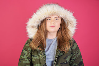
  I like this image because I like how there is no expression on her face at all. I was inspired by the photographer Thomas Ruff who photographed individuals against a plain background, wearing ordinary clothes and remaining totally emotionless. I think that this is a interesting way of photography people because we can only see the surface (the outside of someone and the emotions they are showing etc) and we cannot take anything specific from this image. Furthermore, we cannot know for definite what the person is thinking and even is she was smiling while the picture is being taken, how can we really know for sure that they are happy? This is an example of a head shot which I took in a studio using soft lighting, an ISO of 200 and a low f stop.

Progression


      To edit this image, I used Photoshop to crop some of the image out, as there was a black object in the upper right corner. I also adjusted the saturation, vibrancy, contrast and brightness. With these subtle adjustments that I have made, I feel that the colours have been brought forward more and her facial features are more defined. This ensures that the emotionless expression she is portraying is eye catching. If I were to take this image again, I may do a closer shot of the face so that the facial expressions are the main focus rather than anything else. I could also use different coloured backgrounds (like Thomas Ruff did) and see if they present a different mood.


Evaluation


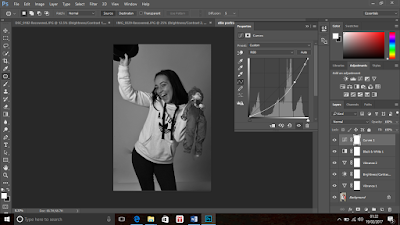
  I chose this image as one which I wanted to focus on and edit etc. because I like how there are props being used and the expression she is showing. This image is very different to the one shown above. It is an example of a half body shot which was suitable in this situation because we are able to look at her body language and how it differs from the image above. I like this image because it allows us to know more about her as an individual. Furthermore, her own individual personality is shown here for example, the way she is holding the props and her body language is not rigid. She looks more relaxed than the person in the picture above. However, in my opinion this is less interesting than the picture above because there is a limit of what we can take from this image. For example, we may just think that she is having fun and is happy due her smiling etc. and we tend to think no further about the expressions she is showing.


Progression


  To edit this picture, I used Photoshop to make some adjustments surrounding the vibrancy, contrast and so on. I feel like this had made the picture more vivid and the features of the picture more defined. The different tones are contrasted better. I also progressed this image by changing it into black and white and adjusting the curves settings which I think has added further to the vividness and contrast of the tones. I also use the 'patch tool' setting to remove any imperfections within the background which has made the image look tidier. If I were to take this image again, I would use different coloured backgrounds and see which works best with the sense of happiness I was trying to convey in this image.


Progression


  I chose this image as one which I should aim to improve because I wanted to take photographs for portraiture photography which were similar to the style of Thomas Ruff. The picture to the right does not really work with what I wanted to achieve. I needed to take images which were head shots rather than half body shots, to really focus on the facial expressions. Her head is slightly off centre here too.


Further Progression


    Here I took a image to show further improvement and progression within this topic of portraiture. I photographed her in dark lighting because I like the contrast of light and dark on her body. I think that I have made an improvement in the way that I take portrait images. I tried to photograph using different angles, lighting, camera settings etc. I really like how her face is defined by the warm orange reflections. I could use Photoshop to edit this image to present further progression.

Thursday, 1 December 2016

Portaiture Straight Images


  I like this image because she is showing little emotion and we are encouraged to try and make something of the picture. This image is similar to the work of Thomas Ruff whereby he photographed people showing little or no expression, against a blank background and wearing ordinary clothes. He wanted to make the images as casual as possible. I like this image because there is a limit on what we can take from it. We cannot possibly know what emotions the person is feeling and even if they were portraying a specific emotion, how do we really know that they are feeling this?


This image is a half body shot. She again, is showing little emotion which is similar to the work of Thomas Ruff. I like this image because the white and faint background makes her body language and facial expressions more defined. The colour white may represent simplicity, which would work well with the idea that she is emotionless. I will use Photoshop to make adjustments to this image.


Monday, 28 November 2016

Portait Techniques

Manual setting - 
ISO 200,
F STOP ?,
SHUTTER SPEED 1/125 OF A SECOND

Equipment
Soft box
Reflector
Light diagram

Portraiture Image Bank


Portraiture Definition Post


A portrait is a painting, photograph, sculpture, or other artistic representation of a person, in which the face and its expression is predominant. The intent is to display the likeness, personality, and even the mood of the person.
Portraiture - A painting, drawing, photograph, or engraving of a person, especially one depicting only the face or head and shoulders


  I like this image because you can see the emotion of the little girl's face. This makes us think deeper into why she may be pulling this face etc. I like the dark background because it reflects her emotion. 


 This image does meet our standards of a poetical/war hero because the expression on his face looks grumpy. Stereotypically as a prime minister (which he was during World War II), you would think of them as harsh and powerful. The dark and harsh lighting really brings out the masculinity and dominating look that he wished to portray to the wider population. 


  This image represents femininity through extreme makeup such as the big lips and heavy eye makeup. This woman is transgender and has aimed to represent Marilyn Monroe. This image in general is fairly extreme and the way that she is laying against the leopard print background is eccentric. This could portray being comfortable within your own skin and expressing who you are which may be important to this individual due to being transgender. 


Framing Contact Sheet

Reflection Contact Sheet

Thursday, 24 November 2016

Landscape Work Diary

Planning


Evaluation and Progression

Evaluation


  I chose this image as one which represents landscapes well because I like the colours and how the trees are bare and we can therefore see segments of the sky in the background. This creates a really picturesque landscape which is calming and quiet. Vertical lines represent strength and power which goes well with the idea of trees (production of oxygen) as an essential for everyday life. The trees are long and tall which presents a sense of strength. I like the angle which I have taken this at because the trees lead us to the top of the picture.

Progression 


  To progress this image, I used Photoshop to adjust the exposure, saturation, gamma correction and contest. This made the autumn colours in the trees really stand out as they were originally quite dull and dark. This image now makes me feel warm due to the orange and yellow tones. they stand out against the white background. The lines represented in the picture are more prominent. I really like this image because the colours are intense which portrays the wide variety of colours we see in autumn.  

Evaluation


I like this image because the long pavement means our eyes are led towards the end of the picture. I also like how the picture looks simple and tidy but is still effective. I like the mixture between greens and yellows however, I think that I should convert it into black and white because the colours here are darkened due to the overcast sky. 
  
Progression

   
  To progress this image, I used Photoshop to convert it into black and white. I think that this works better because it highlights the tones in the picture better. I used the dodge tool in Photoshop to highlight specific areas within the picture. I also used the burn tool to darken some areas of the sky. I have consciously made adjustments which are more effective in 'leading' our eyes to a certain area. I think by using these tools, it has created a picture which represents landscape from a different perspective.  If I were to the this image again, I would take it more centre orientated so that our eyes lead straight into the end of the picture.              

Evaluation 


I like this image because it is different and is not something people would usually think represents a landscape. I like the damp patches on the floor because they are reflective of the light above. This picture has an opposite effect to the alternate images because it does not supply me with a warm feeling. This is because the colours here are very bland and cold, unlike the warming oranges and yellows. However, I like this picture because it presents landscape photography in a different way.

 Progression


   I made subtle adjustments to this image using Photoshop because I think that it worked very well previously. However, I used Photoshop to change it into black and white, adjust the contrast, curves, exposure and offsets settings. I think that these changes work well because the black and white is well suited to the damp and cold nature that this image portrays. I also used the dodge tool to highlight some particular areas which I wanted to be more highlighted and I used the burn tool to create shadows in areas which I wanted to be darker. This image contains a range of tones and portrays landscape effectively and intriguingly. If I were to take this picture again, I could use a tripod to steady the camera while taking the image at a lower angle.


Progression


 I chose this image as one which should be adjusted or retaken because I do not think that it accurately presents landscape. I think that it is uninteresting and should be taken at a better angle. I could maybe use a tripod to take an image at a accurate angle and maybe to get more of the building and landscape in. I went back to retake this image (shown below). I think the mage shown below does work better than the one previous however, I would need to make some adjustments using Photoshop using crop, contrast , curves and so on to improve the appearance of the picture. I could also turn it into black and white as I do not like the colours presented in this picture.


Landscape Straight Images


  I like this image because I think that it has potential to be a good landscape image. I like it because it is peaceful and I like the autumn colours such as orange and yellow. The trees represent vertical lines, which imply strength and direction. I also like this picture because the trees are mostly bare, which allows us to see parts of the overcast sky. I could use Photoshop to make the colours more vibrant and eye catching as they are fairly muted and dull here. By doing this, the autumn colours that I like will be intensified.


  I chose this image as one of my favourite takes on landscape photography because I like how our eyes are lead into the picture due to the long straight pavement. I like how there are no distractions in this picture ad the landscape is completely empty, because it does not divert our eyes anywhere else. I could use Photoshop to turn this image into black and white as I feel it would look better this way. I could also use the dodge and burn tool within Photoshop to create more defined tones.


I chose this image as one of my favourites because I like the light coming through the clouds and how the sky looks dainty and soft. I also like it because the sky is really the only bright thing in this picture. This image presents me with feelings of freedom and relaxation which  may be due to the spacious area that I have photographed. I may edit this photograph to make other areas more visible and enhanced rather than just the sky.


  I like this image of a car park because it is different to what I would usually photograph for landscape photography and is a more unique idea of landscape. I like the reflection of the light onto the floor and the low ceiling. However, I could use Photoshop to make some adjustments regarding the colours and tones in this image because the image displayed above presents some suffocating and depressive feelings in my opinion.


Tuesday, 22 November 2016

Ansel Adams Research Post


 Ansel Adams was an American photographer and environmentalist. He created the zone system shown above which was a scale of 1-10 to help identify different tones. He not only focused on tones but looked widely at landscapes. Adams commonly linked the two subjects together - manipulating his landscape photographs to show a wide tonal range.


This is an example of Ansel Adams' work which shows a wide range of tones. It is a good representation of his usual work and focus point. This picture shows large depth of field because it is all round a sharp image. Ansel Adams often focused on natural landscapes rather than man made landscapes. He tied together his connection to the environment (due to being an environmentalist) to his love of photography. This is commonly seen within various famous photographers work (for example, Vivian Maier and her tying of her occupation as a nanny and photography). The stream  catches our attention because of the light tone it shows and the fact that it leads us into the photograph (leading line).


   This image is another piece of Ansel Adams work which again, presents a wide tonal range. There are extremely bright whites which highlight certain areas and therefore are eyes are more drawn to this. Our eyes are close drawn to the reflection of the sky onto the water which is very clear. The clouds look soft and puffy and the grass looks untouched, presenting the natural world in a more picturesque way. I like this image because you can see the real contrasted difference between the bright white highlights and the dark tones.
 

  I chose this image taken by Adams because it not only explores tone, however it explores form of the natural world also. The rocky and jagged shape of the boulder creates a sharp contrast with the soft and calm clouds. I like this image because the way in which the photographer has taken it, makes it seem as if the boulder is touching the sky which creates a intriguing illusion. It is more interesting than the other images of Ansel Adams which I explored because it looks at more than one topic in photography. I could possibly attempt to bring these two topics together when shooting my photographs.
          

Joiners Work Diary

Planning

Evaluation and Progression


  Here I used Photoshop to create a more unique joiner. I like this because I have layered different images on top of the original images which include his face/body from different angles. I adjusted the capacity setting on Photoshop which helped me to create the fading effect on some particular images. I really like this joiner because it creates an illusion. I could possibly add further images to the joiner to make it more interesting.

Evaluation and Progression


  I used a similar technique as the joiner above when focusing on this one. I took small scale images of separate parts of her body in the studio. I then used Photoshop to make adjustments to each of the smaller photos before I merged them all together to make this joiner. I joined images together which obviously did not match together accurately, which creates an illusion. I think that this piece of work is successful in showing my ability to use Photoshop to the standard in which I require. I like this joiner because it is not perfect, not every image is accurately matched with the corresponding one. 


Progression 

  To further progress this project I could try to use different objects to join together. For example, taking images of different parts of the flower and joining them together. I could also try to work with images of a building and join them together. This would add variety to my work rather than just photographing people. 


Joiners Image Bank