Monday, 21 November 2016

Landscape Definition Post

Landscape - all the visible features of an area of land, often considered in terms of their aesthetic appeal.


 This picture is of a picteresque landscape.   


Ansel Adams Landscape Photography


Ansel Easton Adams (February 20, 1902 – April 22, 1984) was an American photographer and environmentalist. 


Group f/64 was a group of seven 20th-century San Francisco photographers who shared a common photographic style characterized by sharp-focused and carefully framed images seen through a particularly Western (U.S.) viewpoint. 

The Zone System is a photographic technique for determining optimal film exposure and development, formulated by Ansel Adams and Fred Archer.

Pictorialism is the name given to an international style and aesthetic movement that dominated photography during the later 19th and early 20th centuries.  
An approach to photography that emphasizes beauty of subject matter, tonality, and composition rather than the documentation of reality.

Methodology - a system of methods used in a particular area of study or activity.


Colour Contact Sheet

Monday, 14 November 2016

Joiners straight images


I really like this joiner that I have completed because the fading effect of particular angles of his face is an alternative but more intriguing way of presenting joiners. It makes it more confusing and random, which is commonly the effect that joiners ate meant to have. I could turn this picture into black and white because I think it would supply a particular interesting effect.


I think that this joiner worked particularly well because I managed to fit together most of the pieces accurately.  I think the size scale I have managed to represent accurately also.  I like how the colours are different in each picture (for example, her jacket is two different greens in two different pictures) because it shows how individual pictures may differ from others. To edit this, I could use Photoshop to change it into black and white because I think this particular joiner would be more effective and it means we focus more on the unique and unusual shape that joining pictures together makes. 

Joiners Definitions

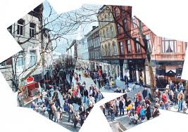
Joiners - In the early 1980s, Hockney began to produce photocollages, which he called "joiners," first of Polaroid prints and later of 35mm, commercially processed color prints. 


  This is an image of a crowded town which has been assembled by someone. They have misplaced some parts of the picture, turned pieces around to create different angles. We as human beings can work out what is happening within the picture despite the picture being aligned and set out how we imagine it in our heads. This is why I find the topic joiners interesting.


Examples of David Hockney's work:
     

Framing work diary

Planning


Evaluation and Progression


Evaluation

  I chose this image as one which I wanted to progress because I think that it has potential to be a great representation of framing photography in a unique and abstract way. The frame is the wooden edges in the foreground. I really like how the foreground is focused and the background is unfocused. The barbed wire creates a distinct sharpness. This image also ties in with the subject topic texture because the rough wooden frame and the sharp and vicious look of the barbed wire presents texture. The background contrasts with the sharp barbed wire and rough wood texture presented because trees and nature represent life, purity and growth.

Progression


  To edit this picture, I made the colours in the background more saturated and vivid. By doing this, it has created a more distinct background for the sharpness texture and shape of the barbed wire to contrast against. The picture is brighter as a whole which good in this case because it outlines the frame which we are looking through. I also adjusted the contrast, vibrancy, exposure and brightness because it was really effective in helping towards a picture which really stood out. It has brought the background to life which was originally unfocused and dark. Furthermore, overall it has brightened the picture and has made it more effective in showing framing of the background.


Evaluation


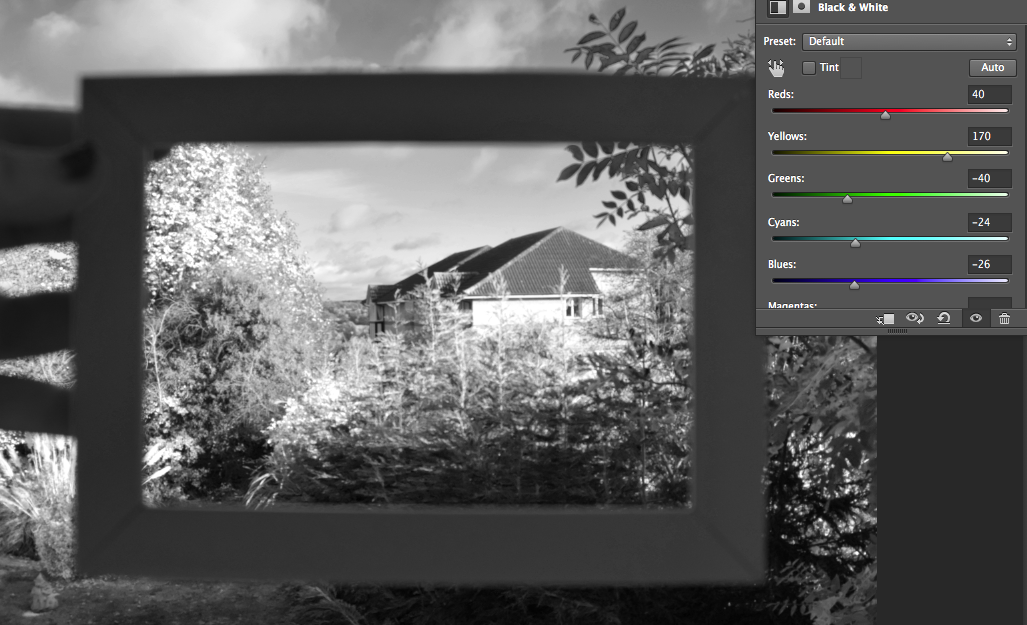
  Here I have taken the idea of placing a literal frame onto a background to represent framing photography in a simplistic but effective way. I took the idea from my image bank which I had gathered because it interested my how it is very basic but effective. I like how the the frame isn't that focused but the background presented within the frame is, causing us to look into the frame. A frame would usually hold a picture but in this case, the background is the picture within the frame. I like it because it creates confusion but interests you at the same time.

Progression 


   To progress this picture, I used Photoshop to change the picture into black and white and adjust the colour levels to create a more vivid picture through the frame. I then adjusted the vibrancy and contrast because the 'picture' see through the frame was not particularly vivid. I like how my hand is blurry and by changing it into black and white, we focus even less on the hand in the picture. This is god because our eyes are lead straight into what is represented within the frame.

Evaluation


  I chose this image as one which I wanted to progress because it extends further than the other images shown above. For example, it represents framing within framing. The frame in the foreground frames the background however, there are also frames within the background. Not only this, but there is more than one frame within the 'whole frame'. There are smaller, individual frames within the large frame. This is more effective because we can look through each individual frame and see different segments of a whole picture within small sections. I also like the metal look because it creates a thin outlined frame.


Progression

   To progress this image I used Photoshop to make subtle adjustments such as: the increase in saturation, vibrancy, exposure and contrast. The colours are now more drawing and saturated which makes the picture more interesting. I think that with the changes that I have made, the picture works really well and is an interesting take on framing photography. The angle works well with the objects also. If I were to take this picture again, I would maybe try to cut out some of the pavement and try to focus on getting more of the grass in the picture.


Progression


   I chose this image as one which I needed to progress or retake because I don't think that it works well with the subject topic of framing. The frame is too wide and it is hard for our eyes to be drawn into the image that I was meant to frame. There are too many distractions such as the diamonds on the object which we are lead to. I could possibly take this image again but at a different angle to ensure it doesn't look muffled and rushed.

Tone contact sheet

Sunday, 13 November 2016

Motion Straight Images

   I really like this image because I find capturing falling water extremely intriguing. This is an example of a freeze frame image and I feel as if I have achieved the action and freeze frame of falling water very well. It is hard to take a picture of falling water due to the short amount of time you have to take the photo. I adjusted the shutter speed setting on the camera to 1/2000th of a second so that I was able to catch the water falling at the right moment. Adjusting the shutter speed when aiming to capture a photograph such as this one is very important.I like how the bird bath is unfocused and the water is in clear focus because it means that the water is the thing we purely focus on and is eye catching. 

 I chose this image as one of my favourites because I like how the roundabout is spinning so fast that we cannot clearly work out where the dividing poles are actually positioned. This is because again, by adjusting the shutter speed I was able to catch the roundabout spinning at a fast pace. It looks blurry due to the speed that it is going which creates an illusion. This is an example of a motion blur picture which I think I have managed to capture pretty well. I like the idea of photographing things which you can move yourself in order to create motion blur because you can move (spin in this case) the objects at whatever speed you desire. I think that this picture would look better in black and white because I do not like the colours. 

  I like this image because it shows motion blur again as movement of a human body. The hand looks blurry because of the waving movement that the person is presenting. Even though we know the form of a hand, it is hard to work out the distinct shape from this picture due to the blurriness, I could look further into photographing people performing different actions such as fast walking, running, riding a bike, hair flicking or playing sports to represent motion blur. I like the background in this picture because it is neutral and does not contain any distractions. It is also a good background to present motion blur because the pale skin contrasts with the dark tones of the trees/bushes which makes it stand out more. 

 I chose this picture as one of my favourites because I like how I have captured the wind chime swaying back and forth. This is another example of freeze frame because I have taken a still image of an object that is moving. The wind chime is moving naturally with the wind and I did not have to move it myself. I really like the lighting and how focused it is because the wind chime is contrasted against the neutral background.