Monday, 31 October 2016

Shape Research Post (Bill Brandt)

Bill Brandt    


  Bill Brandt was a British photographer known for his documentation of British life and unusual and explicit representation of women. He was born in May 1904 and died in December 1984. Despite being born in Germany, he moved to Britain in 1933, where he documented all levels of British society and was quickly well known for his photography. During World War II Brandt concentrated on many subjects but excelled in portraiture and landscapes. To mark the arrival of peace in 1945, Brandt focused on a series of celebrated nudes. 


  This is a piece of work done by Bill Brandt which was taken in South London and is presenting a graceful, white bird. The picture is in black and white which makes the bird stand out better and contrast against the dark background, consisting of gardens and trees. Here, Brandt presents London as a peaceful setting - photography a elegant bird and well kept gardens, with little but a peaceful bird around. He has taken the image which looks like the center of the gardens however, the bird is offset and is not photographed directly in the middle.The bright color of the bird against the dark background means that we focus mainly on the bird and the smooth, crisp shape it holds, rather than what the gardens consist of. Brandt may have wanted to capture pictures of London as a side which many people may have not seen during this period of time (World War II). Most of London was chaotic during this time and therefore, many people may have skipped the opportunity to witness London for it's beauty and peacefulness; many people may have been so focused on the war which was taking place that they missed the chance to be peaceful and recognise the beauty of the place in which they lived.


  This is an image taken by Bill Brandt who also focused on the female form. This image is of a female lying on a stoney beach however, we can only see her legs. The legs are positioned in an unusual way and the shadows casted onto them help towards producing a photograph showing female form in a unique way. The legs look smooth and 'feminine' which helps to match the texture of the soft pebbles the person lays on. Preconceived ideas surrounding femininity suggest that this is a women's body however, by just looking at the legs only, it is hard to known for definite if this is a woman's body. The image is grey scale which helps to recognise the shadows casted and focus of the form that the female body holds. I think that the female form is an interesting subject to focus on because a body has so much potential to create interesting images relating to form. For example, in the picture shown to the left, shows only the legs of a body but there is so much more to a complete body. This brings various opportunities to capture the form of a human body.



Sunday, 30 October 2016

Shape Straight Images


  I chose this picture as one of the best one which I have taken to represent shape photography because I like how the two different watches were different widths and lengths, and how the faces of each watch were different. Furthermore, they each held a different shape. The watch on the right, had a watch face which contained smaller circles and lines etc, adding further to the subject of shape. The watch links were different lengths and widths, but still held a similar shape(s). They also reflected shadows differently, probably due to the angle that I have taken the photograph on (the camera was probably not positioned accurately in the middle of the two objects). The white background helps the different shapes and different reflections of the objects stand out more. The watch positioned to the right, may appear of a thicker width, however the heavier shadow reflected by this watch may make the watch appear a thicker width. This is effective because it outlines how photographing a certain way can distort the shape and it's size etc.


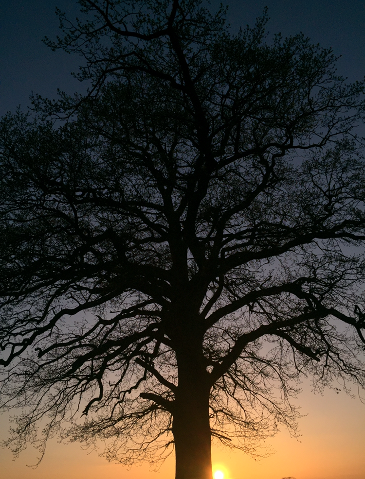
    I really like this image because I feel as if it is a more adventurous take on shape photography. I like how the tree is bare because it creates a more unique shape in comparison to if the tree was full of leaves. The smooth skyline with the sunset in the background works well with the out line because it makes it more distinctive. I had taken this picture previously however, I think that it works particularly well with this subject topic. When working on my progression for this photograph, I will use Photoshop to make subtle adjustments such as: trimming the black border edges around the image, changing it into black and white to show the dark and light tones and possibly adjusting the contrast, brightness and vibrancy. These changes however subtle, will make a extreme difference to the effectiveness it creates relating to the subject topic.


  This image is probably one of my favourite takes on Shape because it is well focused and I like how each element here fits together well. For example, the blue tones shown in the background contrast the white flowers. I like how the outlines of the petals are soft and smooth. However, I could use Photoshop to adjust the contrast so the outlines of the flower is more visible. This way, it would be more effective when looking at the shape certain objects create. I also like how the flower in the foreground is the only one which is in focus because it causes us to focus solely on the shape an individual flowers holds rather than looking at several flowers.


Monday, 17 October 2016

Shape Contact Sheet

Shape Work Diary

Planning

Evaluation and Progression

Evaluation
  I really like this picture. I chose it as one of my favourites because I find it gripping. The sunset has enhanced the shape of the tree and it's branches, creating a sharp silhouette. The tree has a distinctive and crisp shape. I think it is one of my best takes on shape photography because it holds a unique shape and the image is very picturesque. The shape of the tree is distorted due to the bare branches. Furthermore, the shape of the tree would not look as unique if the leaves were not shed because the tree would have a 'full' shape. The angle that I have taken this at works particularly well because it present the whole tree and it's shape. Personally, I would not make any changes to the way I would take this picture, as I think it works well with shape photography.

Progression
   To progress this picture, I used Photoshop to change it into black and white and adjust the exposure and vibrancy. I also zoomed into it, focusing solely on the shape it holds rather than the background. I chose to do this because I felt like although the sunset background did uplift the picture, that it maybe was overwhelming and drew attraction away from the subject topic (shape). I only made subtle changes because in my opinion, this picture didn't need progressing majorly.


Evaluation


    I chose this picture as one which I wanted to look at, edited and progress because I like how the shadows reflected create individual distorted shapes for each watch. For example, the shadows reflected by the watch on the right, make the object seem wider and of a different shape. This shows that how you take a photograph can completely change the shape of something, especially when shadows are reflected in different ways. I like how even though the objects are both watches, that they differ in shape. For example, the watch pictured to the left is longer and has wider links and in contrast, the watch to the right is thicker in size and has more shapes within the watch face.


Progression
  To edit this photograph, I used Photoshop to crop out some of the white background space, because I felt as if there was too much empty space in the picture which made it look quite bare. To progress the picture further, I changed it into black and white, adjusted the levels of colour. increasing the amount of dark tones and reducing the light tones. This made the shadows show better and highlighted the differences between each watch. For example, the face of the watch presented to the right, has more light tones. If I were to take this picture again, I could take individual pictures of each watch and then use Photoshop to place them side by side. This would make it easier to focus closer to the real details of each watch and the shape that they hold.


Evaluation

  I chose this picture as one which I wanted to look at and edit to make it a really effective picture to represent shape photography. I like how only one flower is in focus and there are no distinct outlines of the flower which may be due to the light in the middle of the flower. The unfocused flowers in the background do not show any shape which is why I like this picture because we only focus on the one flower within the foreground. I really like the dark background the the deep blue lighting because it creates a neutral base for the shape of the white flower to really contrast against. This type of photography reminds me of the photographer Imogen Cunningham because she focused on the form that flowers held and photographed them in a similar way.

Progression


  To progress this picture, I used Photoshop to change the dark and light tones. In the original photograph, there are lots of dark tones and shadows. Although the image shown above is still effective without the adjustments, I wanted to enhance the blue tones because it is a gripping colour which draws attention to the picture. The background colour now consists of more purple tones. The colour purple represents luxury, power or oppression (in a negative sense). The white flower works weel with the meaning of power and luxury. It is easier to see the shape of the flower because by adding more light tones I have highlighted the outlines of the flower and petals.


Progression


   I chose this picture as one which I need to improve because it is not intriguing and I think it represents shape in an uninteresting way. It is a stereotypical object that someone would photograph as an easy option. It is not colourful and does not make me feel any particular way. Overall,  I think that it is one of the least interesting takes on shape photography that I have done because it is predictable. If I were to take this picture again, I could on the shapes within the object rather than the object as a whole.


Further Progression


   Here is an image I took to show some progression within this project. I photographed an array of daffodils which I was attracted to due to their colour and delicate shape. I like how there are some particular flowers which have blossomed and some which has not. This creates a variation in terms of their shapes. I like how the background is unfocused because it allows us to focus solely on the soft outline of their petals. I also like how I have captured some flowers from a side angle, because this presents them as having a different shape. I think that this image is a good take on shape photography due to the different array of shapes of the flowers.

Shape Image Bank


     I chose this picture as one which inspired me because I like how the shape of the chilli has been presented. The chilli has been cut into segments, all in which are positioned to create the shape that the chilli would originally hold. Furthermore, this pictures consists of two different ways of presenting shape through photography - each individual segment of the pepper holds it's own shape and secondly, the shape of the 'original' chilli which is created by the pieces. The segments are different sizes and shapes which therefore, presents shape photography in a more intriguing way and the photographer has used their imagination to create something that may be unusual to see within the shape photography topic. The saturated red colour of the pepper is contrasted against the muted grey background, which causes us to focus solely on the object and the shapes that it creates.


   I really like this photograph. The shape sticks out against the background and creates an illusion. The shape looks two dimensional, but is probably not due to the image of a child sitting inside of it. The object is pink and orange which contrasts against the bland background (dull whites, blues and browns). The background looks 'pure' which provides us with calm and sensual feelings, however we get a sense of panic once we look at the triangle shape which looks abnormal within this setting and looks 'out of place'. The child sitting inside of the shape looks trapped which makes us feel uncomfortable. The photographer has consciously positioned the shape against a background such as this one, to create a great contrast between the natural world and objects which have been put into place. This picture almost makes me feel uncomfortable. However, I would really like to use the idea of placing an object in a obscene setting, to create confusion and to break up the background. For example, placing a red apple in the middle of long grass.


  I like this photograph because I like how objects within the picture are shown as two dimensional, even though we recognise that they're not.  I like how only the silhouette of the trees and the bird and little or no details can be seen. This works best with shape photography because it means that we look at the different shapes within the photo, rather than what the object is etc. The tree is bare which creates a more vivid and definite shape in comparison to if the tree had all of it's leaves. The sunset in the background contrast against the black silhouettes and I like how the bird's body is split into two halves between different backgrounds - half of the body is incorporated into the moon and the other half has the sky as a background. I could use this idea of photographing silhouettes of objects with distorted shapes and I could also use the idea of photographing objects against different backgrounds such as different times of the day (sunset, nightime etc).


  This is another example of how a background can be broken up by placing a shape somewhere within the picture, The coffee beans make a continuous irregular pattern until we reach the star shape which has been consciously placed to create an eye-catching effect. The wooden effect that the star presents, contrasts with the brown, smooth look of the coffee beans. I like this idea because it is simple, yet has a big effect. I could again, use this idea in future projects or within shape photography.


Shape Definitions

SHAPE (definition).
•A shape is an area enclosed by a line. It could be just an outline or it could be shaded in.
•Shapes can be either geometric, like a circle, square or triangle, or irregular.

•When drawing shapes, you must consider the size and position as well as the shape of the area around it. The shapes created in the spaces between shapes are referred to as negative space.
Shape - the external form, contours, or outline of someone or something.

 I like this photo of shape because it has a deep meaning. The elephants are creating a heart shape which  could represent them being in love. The warm sunset in the background works well with the idea of love. 


  I think that this photo does not represent sexual objectification because the woman has is almost shielding herself, despite her being exposed. The photographer has used negative space to highlight the body of the woman. This links to what he wanted to look into - the female form.  


Tone Straight Images


   I chose this picture as one my my best because the contrasts in tone between the dying leaves and the alive leaves is significant. The picture presents some green colours which are saturated in tone and some brown and yellow leaves which are muted tones. If I were to edit this picture using Photoshop, to turn it into black and white, we would be able to see the major differences between the harsher tones and the softer tones, without knowing which tones were dominant in the original picture. The black pavement which we can see slightly, adds extra contrast to the picture; this would be easier to see if it were in black and white.


  I like this photo because it is a representative of tones within portraits. I explored how different lighting and different backgrounds can create different effects. For example, here I photoshopped her using dull lighting which was reflected onto her face are and a dark background. This create a harsh effect and could be classed as more masculine lighting. In this particular instance, the jumper that she was wearing contrasts majorly with the different tones. It adds a bright white tone which can be selected alongside the tones shown within her hair and face. Half of her face is dark due to the position of the lighting, which contrasts with the opposite side of her face, which is brighter. 


    I really like this picture of the sky because it is filled with clouds that consists of different tones. There are a lot of dark tones, which is why the bright tones make a big impact. The small segments of light tones such as the patch of sky and the bright light shining through, break the picture up and are more noticeable due to the amount of dark tones visible. However, although the picture shows tone well already, I will use Photoshop to turn it into black and white; this will contrast the soft and harsh even more. 


   I like this picture because it is an alternative to the harsh lighting image that is previously shown. It was taken in very bright, soft lighting and shows more details. There is less of a range of tones in this picture and little contrast. This lighting looks more 'elegant' and more feminine - it doesn't make you look like a criminal! Her skin looks soft and there are no dark tones on her face in comparison to the once shown previous. The background is lighter than her skin tones, hair tones and the colour in her jumper which creates contrast, but very little of it. I could adjust this photograph using Photoshop to increase the variety of tones shown. 

 I chose this image to be one of my straight images because I think that once edited, it will show up the different darks and lights within the beaches, leaves and the sky. I think that I have taken it at a good angle because it is from underneath the tree; this shows the different tones starting from the core of the object, right out to the edges of the branches. I will use Photoshop to adjust the different tones, especially incorporate more dark tones so that the image will represent the subject topic of form more efficiently.