
Wednesday, 12 October 2016


Monday, 10 October 2016
Tone Work Diary
Planning

My subject topic was Tone. I focused on how to photograph different tones and tried to explore different objects which held a variety of tones. For example, I looked at portraits and using different lightings that were conceived as 'masculine' or 'feminine'.
Evaluation and Progression
Evaluation
Evaluation

I chose this image as one which I wanted to explore and improve because I really like it. However, although this picture worked really well with the subject topic, I think that it needs some improving because it does not show many light tones. The minimal and husky lighting that I used was reflected onto her face, which created a darkness which only shadows half of her face. It is easy to pick out different tones that contrast with the dark shadows such as the illuminating white within the jumper and the blonde colour of her hair. A dark background was used to reflect the look that I was trying to create. The lighting and different harsh tones used could be conceived as masculine because it does not create elegancy and makes the face look harsh. The 'poker' face that she is pulling works well with the effect we were trying to perceive because it works even better within the idea of this lighting being 'harsh'. In this case, the white in her jumper stands out well against the dark background because there are two opposites - her jumper is literally bright white and the background is pure black.
Progression


Although the picture already worked really well with the subject topic, I felt like it needed to be improved because there were minimal light tones in the picture. The first adjustments that I had done which was working towards more bright tones, came out too overpowering (as shown on the right). Her forehead was too white and the jumper had been illuminated in colour despite it being bright white already. Therefore, I need to make other adjustments to get a perfect balance of light and dark tones.
 Furthermore, I deleted the 'curves' filter that I had originally used to adjust the tones and took a different approach. I adjusted the brightness and contrast, making it brighter but also more contrasted at the same time. This provided a better outcome and I think that it has created a good balance between the different white and black tones in the picture. Lastly, I zoomed in on the picture so that you could see the face and therefore, the different tones within it more clearly. If I were to take this photo again, I would turn the camera sideways so that the image was portrait instead of landscape. I would also take a few images while moving the lighting to different positions and pick the best ones from these. This would avoid making mistakes and having to use Photoshop to improve it.
Evaluation

I chose this photo as one of my best because I think it has potential. It would be a great representative of tones if I edit it on Photoshop and adjust the contrast. I like it because the angle I have taken it, focuses on the core of the tree, right out to the edges. The bright sky shining through the tree creates a bright white tone which contrasts with the dark tones of brown on the branches. I think that this is interesting because by looking at nature, you can look at what different tones different parts of a plant/tree/flower (example) hold. They have grown this way naturally and formed this specific tone of colour naturally. Trees help us to survive which makes it more interesting to look at how each individual segment of the tree grows and how the trees change within seasons etc.
Progression


To edit this photograph, I used Photoshop to change it into black and white. It is important to be able to differ from different extremes and I felt as if in black and white, it showed up the different tones better. I adjusted the brightness, contrast and the vibrance of the picture because although it worked better now i black and white, it was still quite hard to point out the extreme differences between tones. I then used the curves option to adjust the dark, harsh tones within the image. It make the less visible dark tones, more visible and darker and which created an even balance of dark and light tones. If I wanted to create an image which the dark tones were dominant, I would use curves to make the harsh tones intense. However, I think in this instance, a level balance of the two opposites works best. Lastly, I zoomed in on and cropped out some of the picture because I didm;t want too much of the bright background which was shining through the trees to show in the end result because it was too bright and overpowering. If I were to take thous picture again, I would ensure that I took different pictures of the same object, but at different angles and distances. For example, I could look closer at the leaves and the different tones they hold individually.
Evaluation

I chose this image because it explores soft lighting which could be classed as more 'feminine'. Her skin tones is smooth and there are little shadows presented on her face, unlike the picture shown above. Shadows reflected from her body are not shown on the background due to soft lighting being pointed directly at her face/body. The extra lighting means that there is little room left for shadows to be reflected. I did not complete any progression with this photo because I felt as if I had achieved the outcome in which I wanted, in relation to presenting soft lighting.
Evaluation
 I chose this picture as one which I wanted to look at and progress further because I think that by photographing the sky, you can show a variety of different tones, but in a simplistic way. I like this picture because it looks as if the sky fades from dark to light, which once edited, will clearly show two opposite tones. It shows how the weather can be temperamental - going from dark to light sky/clouds.
Progression


To improve this picture, I used Photoshop to make some adjustments. I changed the picture into black and white, adjusted the brightness/contrast and the levels of colour. In my opinion, the black and white filter works best when looking at tone photography because it shows the variety of tones the best. The final outcome presents greatly contrasted tones- there are some really bright white tones and some dark tones. The trees add extra dark tones to the picture which were required due to lack of them. If I were to take this picture again, I would try to include more trees to add further dark tones. I could have also waited for a period of time (e.g. 10 minutes) to pass before taking another series of pictures to see if there was any differences to the tones within the sky.
Progression

I chose this as one of the pictures that needed some improvements made to it. I think that this is a interesting photograph and I like how I have captured the rainbow. However, the sky does not consist of many different tones, as they are all many dark ones. I tried making improvements via Photoshop however, it was fairly hard using the black and white filter, to make any appearance of contrasted tones which is why I think that this picture does not work well with tone photography. I could possibly save this picture and use it for a future project because I do not feel like it is bad enough to discard of.
Evaluation

I chose this image because it explores soft lighting which could be classed as more 'feminine'. Her skin tones is smooth and there are little shadows presented on her face, unlike the picture shown above. Shadows reflected from her body are not shown on the background due to soft lighting being pointed directly at her face/body. The extra lighting means that there is little room left for shadows to be reflected. I did not complete any progression with this photo because I felt as if I had achieved the outcome in which I wanted, in relation to presenting soft lighting.
Evaluation
 I chose this picture as one which I wanted to look at and progress further because I think that by photographing the sky, you can show a variety of different tones, but in a simplistic way. I like this picture because it looks as if the sky fades from dark to light, which once edited, will clearly show two opposite tones. It shows how the weather can be temperamental - going from dark to light sky/clouds.
 Progression


To improve this picture, I used Photoshop to make some adjustments. I changed the picture into black and white, adjusted the brightness/contrast and the levels of colour. In my opinion, the black and white filter works best when looking at tone photography because it shows the variety of tones the best. The final outcome presents greatly contrasted tones- there are some really bright white tones and some dark tones. The trees add extra dark tones to the picture which were required due to lack of them. If I were to take this picture again, I would try to include more trees to add further dark tones. I could have also waited for a period of time (e.g. 10 minutes) to pass before taking another series of pictures to see if there was any differences to the tones within the sky.
Progression

I chose this as one of the pictures that needed some improvements made to it. I think that this is a interesting photograph and I like how I have captured the rainbow. However, the sky does not consist of many different tones, as they are all many dark ones. I tried making improvements via Photoshop however, it was fairly hard using the black and white filter, to make any appearance of contrasted tones which is why I think that this picture does not work well with tone photography. I could possibly save this picture and use it for a future project because I do not feel like it is bad enough to discard of.

Tone Definitions
Tone (definition).
•This
refers to the lightness or darkness of something. This could be a shade or how
dark or light a colour
appears.
•Tones
are created by the way light falls on a 3D object. The parts of the object on
which the light is strongest are called highlights and
the darker areas are called shadows.
There will a range of tones in between the highlights and shadows.
•Without
tone Form does
not exist, tone is therefore an important aspect in the visualisation of
3D objects.


This photo shows tone very well. There are several different tones incorporated into this photo which we can find on the Ansel Adams Zone System. The light is reflected onto her dress where we see the patches which are highlighted. Her face has some dark tones and light tones where the light is reflected onto her face at different angles.

The tones shown in this photo are more masculine tones. This is because the dark tones on his beard and his t-shirt match with a male gender. The dark tones are more harsh which may refers to males more rather than females.

The tones are lighter in this picture which refers best to femininity. The soft light tones look more dainty and elegant which we stereotypically refer to a female.
Pictoralism - Pictorialism is the name given to an international style and aesthetic movement that dominated photography during the later 19th and early 20th centuries.Almost looks old fashioned. Some brush stokes etc may be visible.
Form Photographer Research
Imogen Cunningham was an American photographer who was well known for her form and nude photography. She photographed objects in a intriguing way, catching the eye of many people. She used shadow a lot during her form photography work which clearly has an effect of drawing people in. She focused a lot of living objects such as flowers; taking into account that she focused of form, living objects probably intrigued her because of the way they naturally grow and therefore, the form that they hold.

This picture was taken by Imogen Cunningham and is of flowers. She is popularly known for her photographing of objects which represent form. The flowers are casted in different lightings - the flower at the back is barely visible and we can only really see the outline of the form. This outlines the fact that the details of the object are not really important, but only the form is. She has incorporated tone within her work to create dark shadows. The flowers present a spiral shape and they all roll into one. Most of Imogen's work is in black and white which creates strong and powerful contrasting effects.

This picture was also taken by Imogen and is again of a flower. The flower holds an unusual form and is hard to work out what type of flower it is. It again holds the spiral shape which is interesting to the eye. There are some serious contrasted tones here which is important when photographing form because shadows and lights and the intensity that they are can change the form of an object completely. For example, the bottom section of the photograph contains an intense shade of black; this makes it hard to work out what the object is because we cannot clearly see the form which it holds. There are other objects in the picture but they are not dominant. Objects such as the spikey plant are also intriguing to look at because they hold an unusual shape. Imogen has consciously picked out particular objects to photograph and positioned them in a specific way to create a photograph that draws people in.

Here is another example of Imogen Cunningham's work. When looking at her work, it is not difficult to see that it presents a pattern; she focuses of similar objects especially flowers. Despite this, she photographs them in different ways, showing different amount of specific tones each time. For example, there are more soft tones in this picture compared to the ones pictured above. I like this photograph of hers because the background is muffled and isn't just one block colour; it almost looks like someone has smeared different grey and white tones together, The form of the vase which the flowers sit in is vague and almost is camouflaged into the background - we can only see a mere outline of it. The flowers all hold a similar form to one another which would appear bland to some people if Imogen had photographed it normally.
Wednesday, 5 October 2016
Pattern straight images
 I chose this photograph as one of my favourites because I like the randomness of the shapes within each tile. I like the muted grey/blue colours and how there are different tones of each colour. I like the angle in which I have taken this photograph because I think it shows the individualization and different shapes within each tile more efficiently. I enjoy looking at irregular patterns because they take a more individualistic approach and are more intriguing. To improve this picture I could crop out the bottom edge of the photograph to avoid distraction from the pattern itself. I could also make the colours more saturated so that the different tones and shapes are more eye catching.
I like this photograph because the beam of light shining through the windows show the discoloration/stained glass. This is presenting a regular pattern. Although I find irregular patterns more interesting to look at, I think that this works well because of the different windows. This image could be seen as an abstract way of showing pattern photography, which is why I find it intriguing.

 I chose this picture as one of my favourites because I like this take on pattern photography. I like how each segment of the pyramid shape has identical patterns and how the lines all lead into the same position - the middle. We are therefore drawn to the middle because this is where the patterns all come together as one. After this, we are left for our eyes to divert around the rest of the picture but due to the regular pattern, it all looks similar. This creates a subtle illusion because our eyes have no different places to look due to it all looking the same. I will use this in my work diary to improve and to progress my
 work further.
I particularly like this picture because it is simple but effective. The pattern is regular but distorted, due to the wonkiness of the small tiles. The sphere shape of the pole is interesting because although, we know that the pattern will contain around the sphere, it is hard to pinpoint just by looking at this photograph, where the pattern would come to an end. It gives you things to think about, despite being quite a simplistic way of showing pattern through photography.
Pattern Image bank
 Taking your pictures of repeating elements, it provides picture unity and structure. Repeated patterns create rhythm that the eyes enjoy following. I chose this photo as one which inspired me because it consists of a regular pattern which is broken up by a pattern of a different colour. The rhythm that the eyes follow is cancelled by the different colour. When looking at this picture, my eyes wander around, looking at the pattern however they consistently come back to one spot - the different coloured part of it because this is the segment which stands out more. The contrast between the two colours creates sharpening. Man made objects such as apartments or flats like these are easy to photograph but effective, which is why I will use the idea of photographing buildings to represent pattern.
 I chose this photo as one which inspired me because I like the illusion the patterned leaves create. The black and white effect on the picture has been done consciously to outline the patterns in the picture. The leaves are arranged in a random organisation which is what makes the picture so interesting. My eyes are not drawn to one specific spot like the one pictured above and the leaves are a range of sizes which is why photographing pattern in this way is more interesting. This is an example of taking something natural such as plants and photographing the real beauty within them - the leaves are all different sizes because they have grown this way and the patterns on the leaves have just grown on them and haven't been placed there to create a pattern.
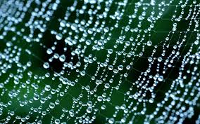 I like this photo because it shows pattern through something natural. The combination of the spider web and the water droplets create a fascinating way of presenting pattern. The photographer has taken it extremely focused with outlines the pattern presented. The background contrast with the droplets and the spider web is almost invisible which works well because it prevemts distractions away from the pattern.
I would like to use the idea of rain droplets in future projects.
Subscribe to:
Posts (Atom)