Evaluation
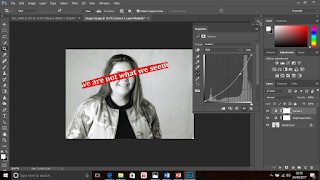
Here is an example of one of the physical images I created. I gathered inspiration from the famous photographer Barbara Kruger and Pinterest. Here I took a portrait image of a female smiling. I edited it within Photoshop to put a black and white filter on it and also adjust the brightness and contrast settings. The reason for this was because the red highlighted phrase which I was going to stick across the image, contrasted better when the image was in black and white - it also related better to Kruger's work. Here I pasted the words 'we are not what we seem' across her face. I covered all of her facial features other than her mouth because I wanted her smiling expression to be visible. I chose to write these words because I wanted to outline the fact that no one truly knows what other individuals have happening behind closed doors or they do not know if how they seem is really how they are. I thought that these words worked well with the smiling expression she has because it makes us question if she really is as happy as she looks. I created this image by hand and then scanned it to get it onto the computer and into my blogger.
Progression

Here is my final and edited image of the one previously shown. I used Photoshop to make some minor adjustments because I liked how the image worked already. Firstly, I cropped some of the wide edges around the main image out because this was negative space. This was due to the scanning of the image. I then adjusted the contrast and brightness of the image to try and introduce some darker tones. This was because the image consisted of many light tones and very little dark tones. Lastly, I used the 'curves' setting to again try to introduce more dark tones into the image. I am very pleased with the final outcome because there is more of a balance between the opposite tones. I think that this image successfully relates to the work of relevant photographers and is a good example of physical image making. I don't think that I would do anything particularly different if I were to remake this image.
Evaluation
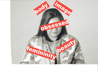
 Shown here is another example of a physical image which I created. I again, used my photographer research and ideas from Pinterest to influence how I created this image and the words which I used. I took a picture of a female who holds and emotionless expression on her face. I chose to put the word 'obsessed' in the middle of the image, covering her face and the opposing words surrounding it. I consciously arranged the words this way because the surrounding words are the aspects which many women are 'obsessed' with. I wanted the picture to look cramped because it relates to how women may feel due to the many pressures they receive to be and look a certain way by the media and wider society - a women may feel trapped. Difference is disregarded of in society and therefore many women feel obliged to fit the idea of being 'perfect' which includes have a certain body type, looking and being feminine at all times and looking presentable when in company.
Progression
Here is a my final edited image of the one presented above. Again, I only made some minor adjustments because I already like the way that the image worked. I made similar adjustments to the previous image because they both required the same changes. I used Photoshop to firstly crop the image because similarly, there was negative space from where I had previously scanned the image. This meant that the image is now more centred and the focus point is more vivid. I then made the image darker and the tones more contrasted because again, the original unedited image consisted of a large amount of light tones and little dark tones. I lastly used the 'curves' setting within Photoshop to darken the dark tones within the image so that there was more of a balance between the two. I am very happy with the final outcome because I think that it relates well with the work of Barbara Kruger. I don't think that I would do anything particularly different if I were to remake this image because I think that it is a successful piece of work.
Progression
To progress my work further, I should complete more physical images which differ to these two. I could possibly photograph a different individual or a different scene, which would add some variation to my physical image work.


